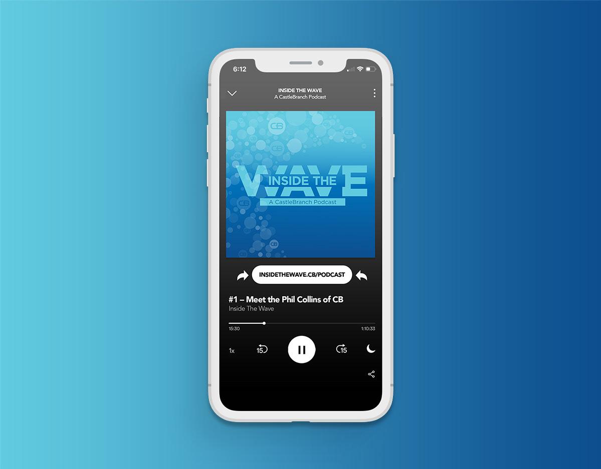
The collection below is a cumulative body of work I created in corporate and advertising agency environments. The branding and print projects displayed below achieved many goals. My designs helped increase brand awareness, establish and maintain brand consistency, cultivate brand/product exposure which led to results–driven feedback.
Branding
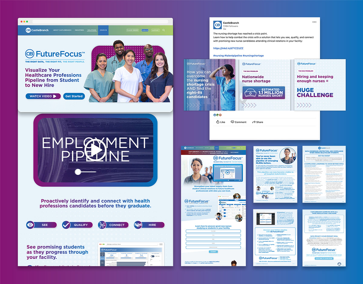
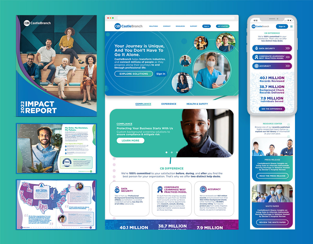
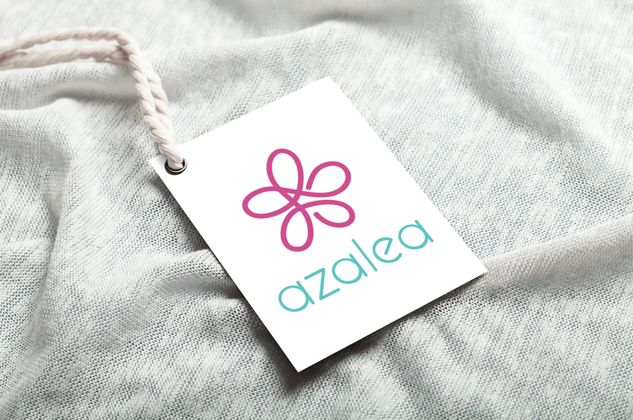
Branding is crucial to establishing and building awareness of a company. The brand identities and graphics below convey clean, minimalistic designs for varying markets. I developed design elements that include the usage of monolines, geometric and dimensional shapes, modern typographic treatments, and complimentary color palettes.
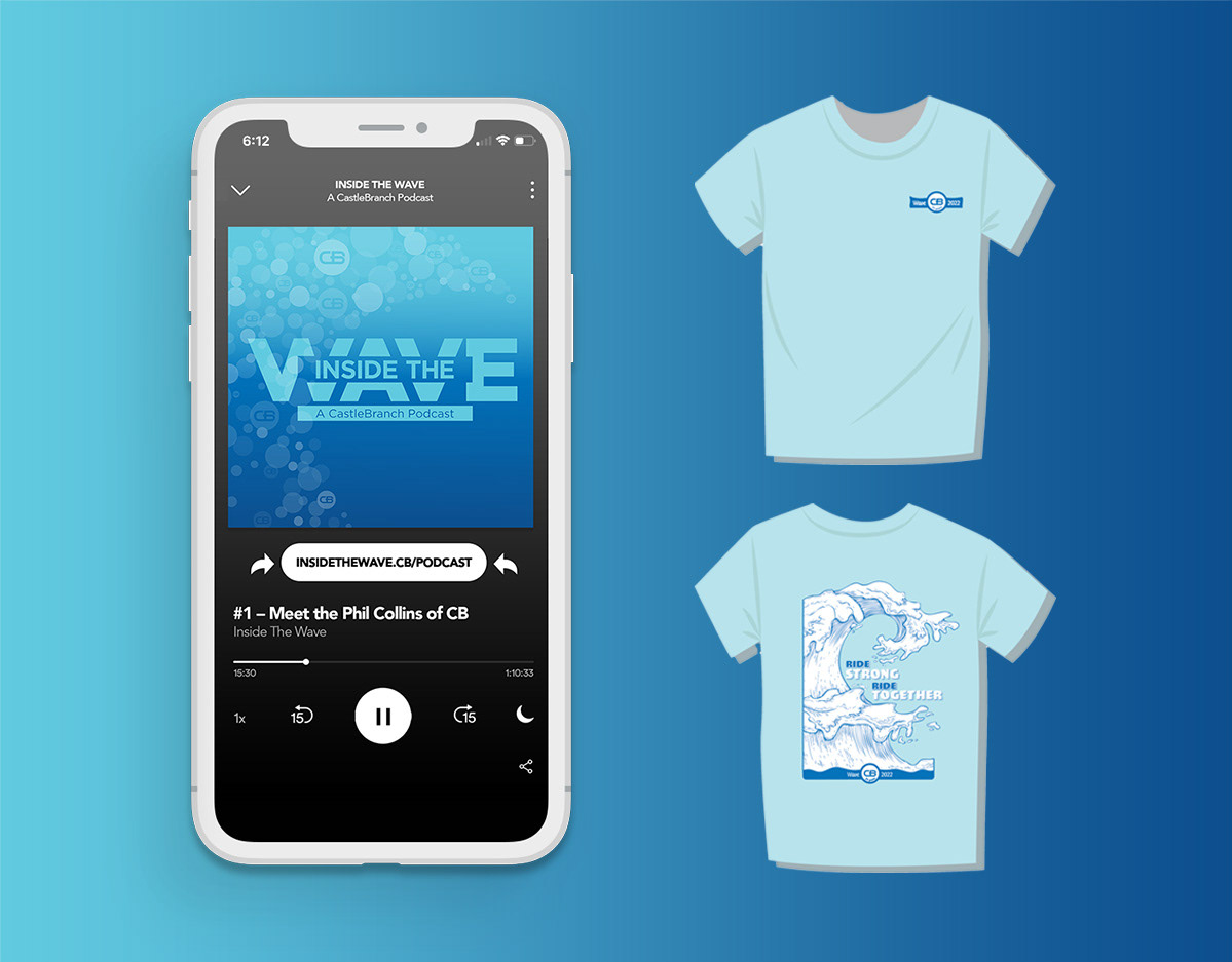
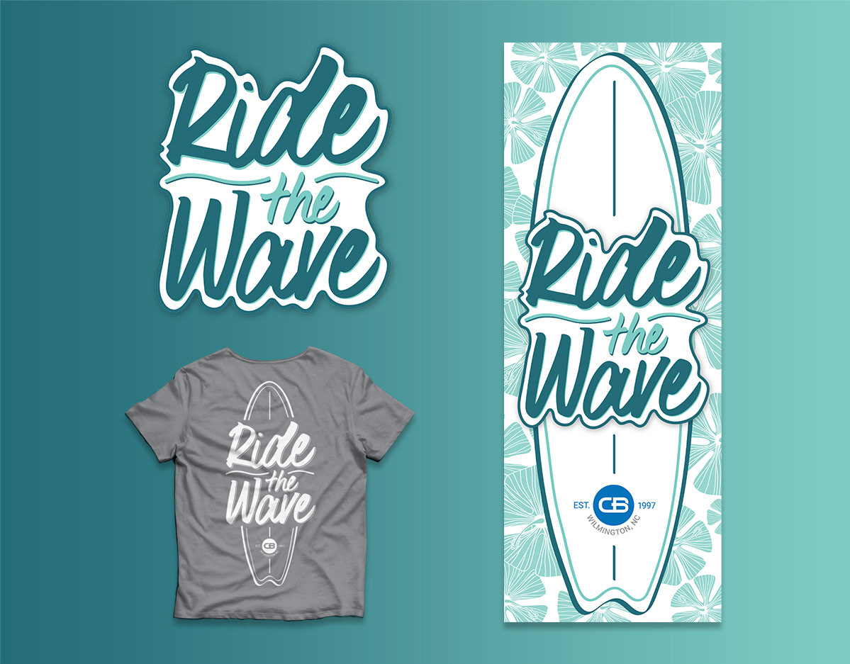
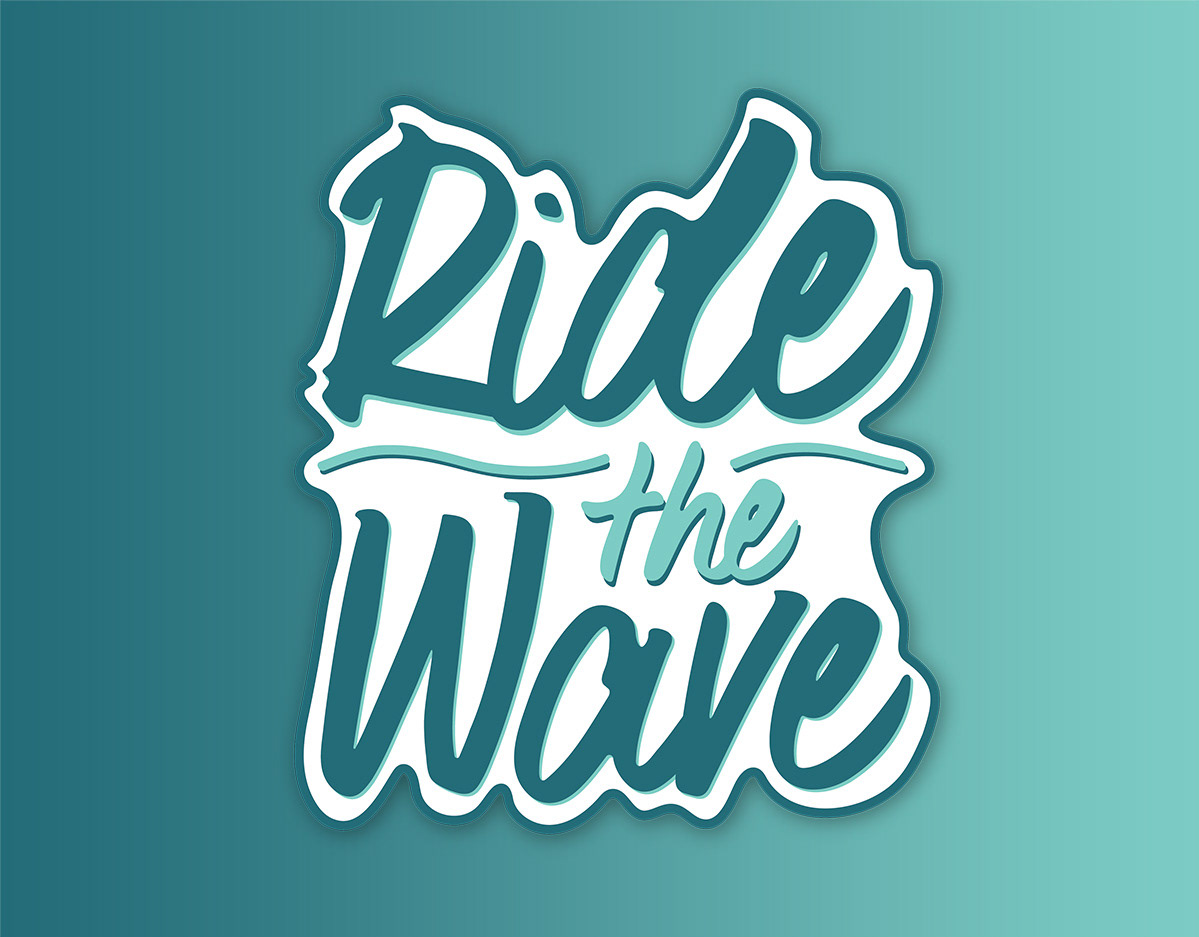
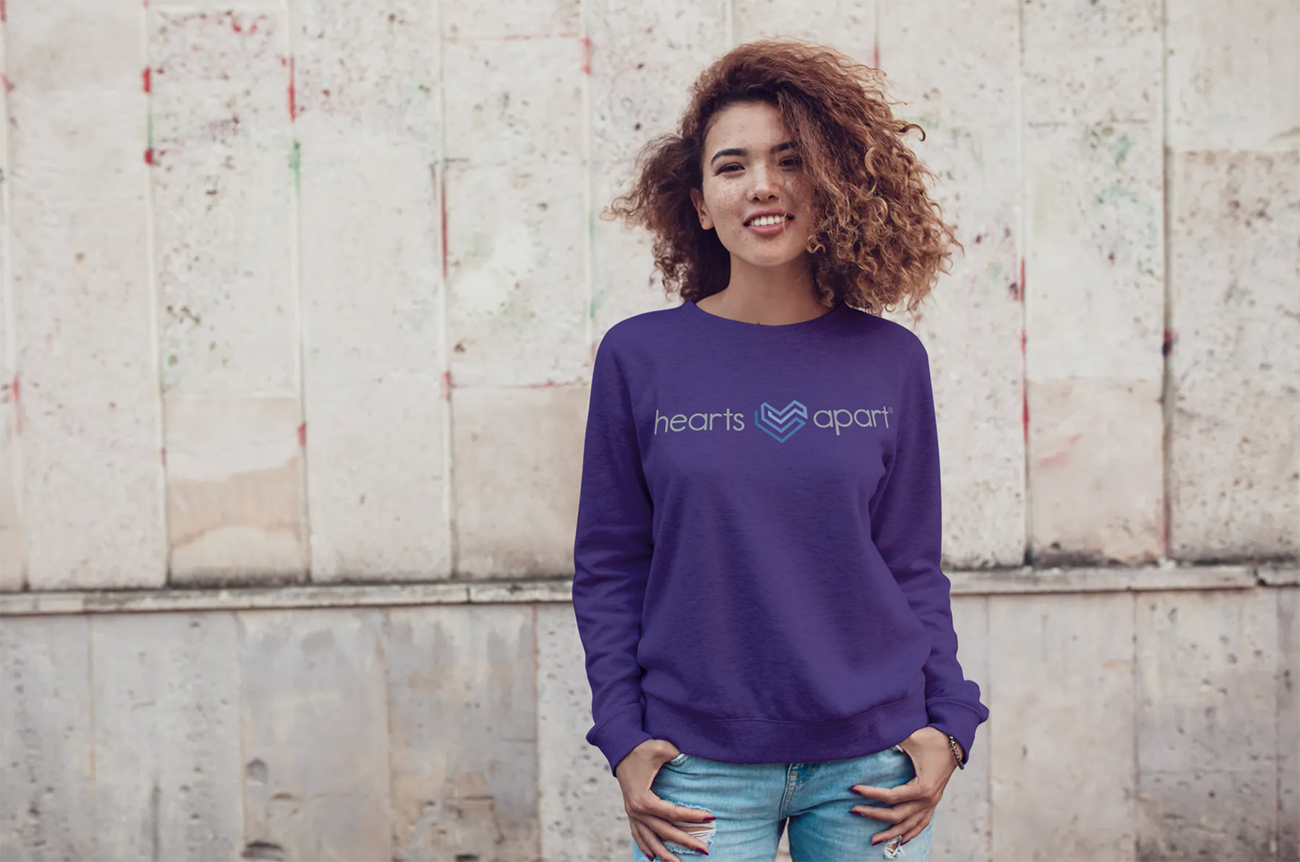
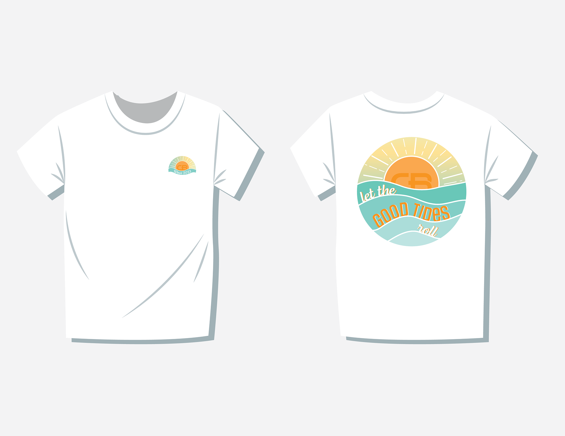
For the apparel graphics, I focused on pushing the bounds through unique, creative designs while maintaining the brand standards. Each design is compatible for a multitude of implementations. The examples shown represent embroidered and screen printed designs.







Print
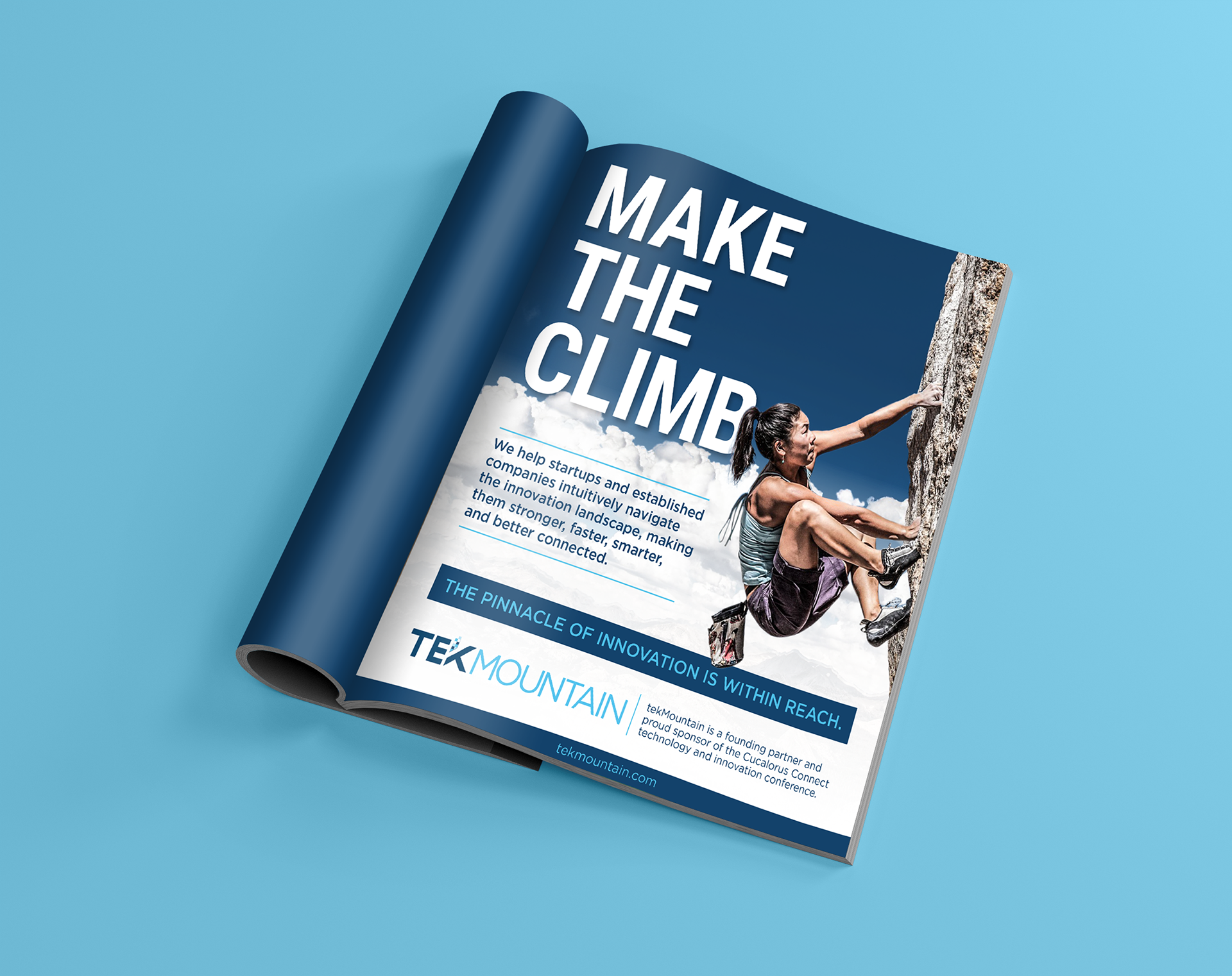
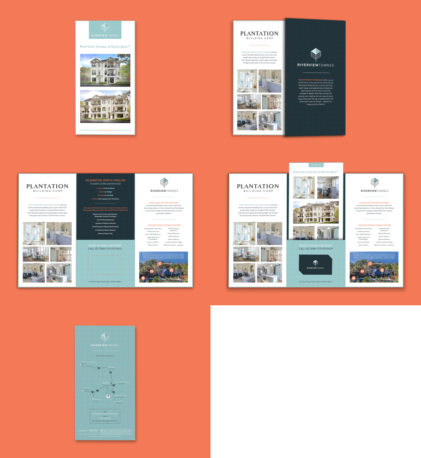
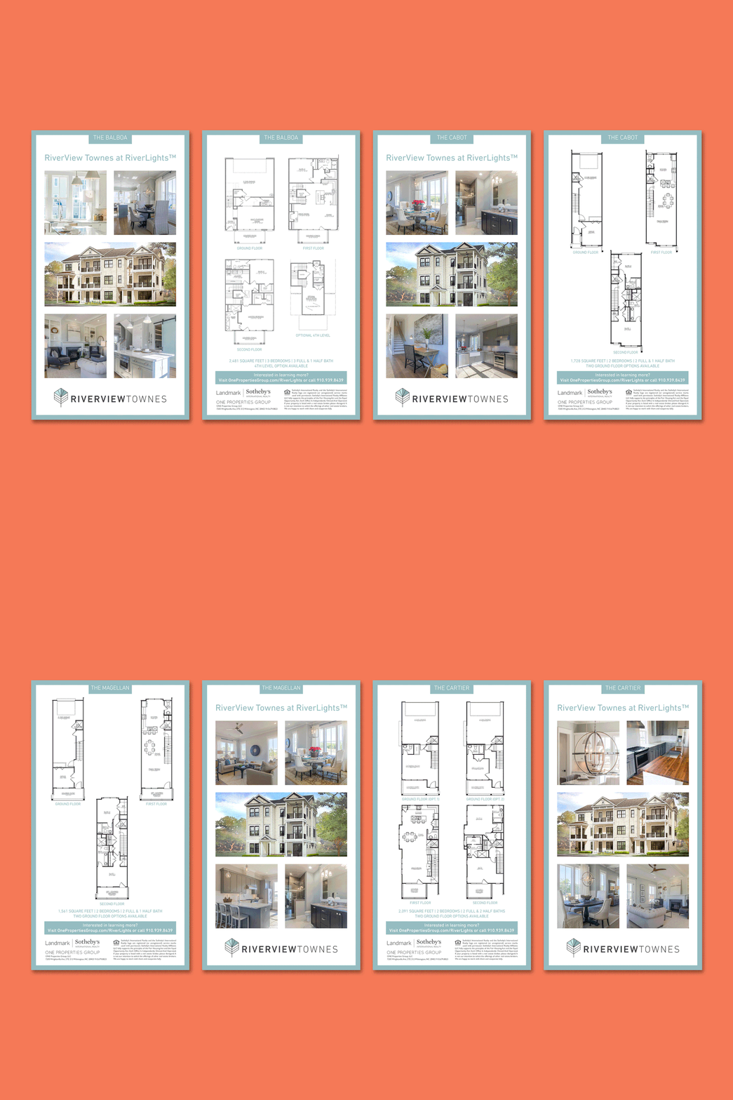
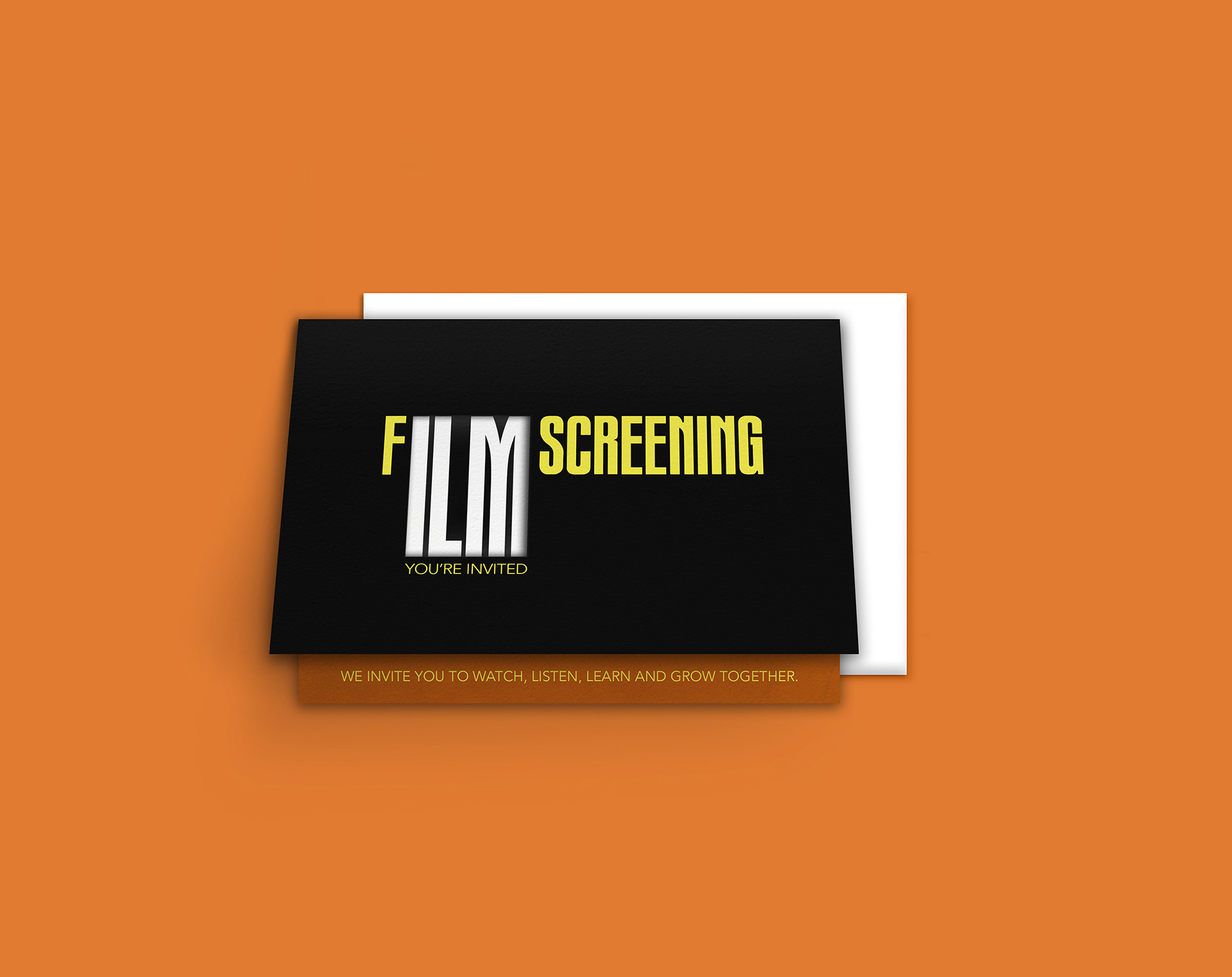
The collection of print materials below include an annual film festival publication ad, materials used in high–end real estate showrooms, quarterly real estate magazines ads, and a film screening event invitation. I used clean, bold typographic treatments to compliment the beautiful photography in the ad designs. This helped engage the readers and increase product/service awareness.
The showroom materials incorporate model home sketches and strong photography along with illustrated floor plan options for an elite townhome community. Each floor plan card follows similar layout designs so the viewer can focus on the model differences. I created the tri–fold folder format to contain important highlighted information about the community on each panel. The center panel of the folder design contains a pocket for the floor plan cards and a business card slot to help keep all materials together.
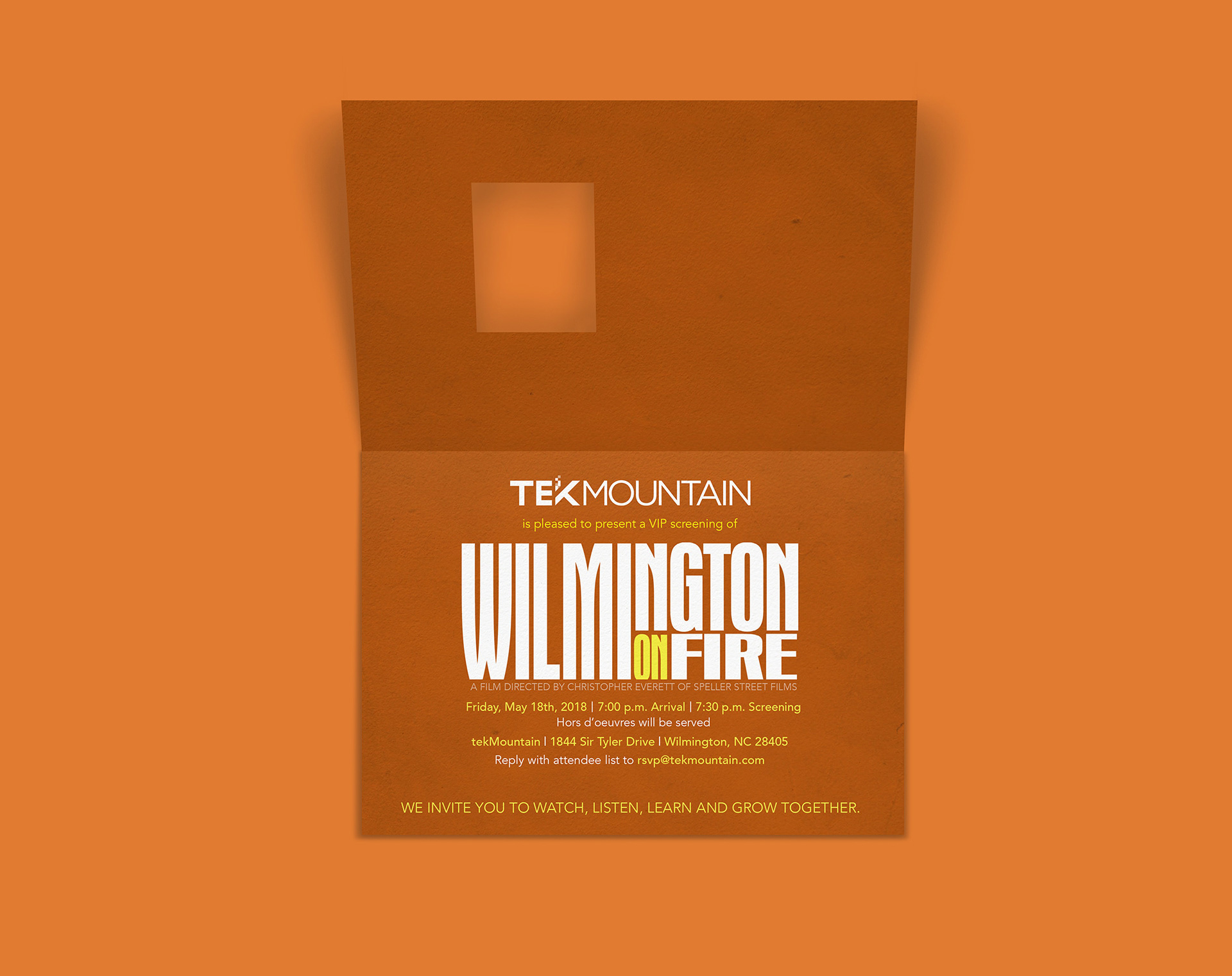
The film screening invitation highlights the importance of typographic placement within a design. As a local Wilmington–based production, local invitees can easily connect with the "ILM" abbreviation for the city name through the die–cut window. The invitation design incorporates the die–cut window to show only part of the text from inside the bi–fold that is dual–purposed by completing the word "FILM" on the outside too.
