As one of the nation's largest data management companies, CastleBranch empowers individuals. Through their innovative technology solutions, they help individuals navigate along their professional journeys.
CastleBranch strives on being a people–first company. It's important for them to connect with individuals from the start through their website and marketing materials.
I helped CastleBranch reach this goal by focusing on the implementation of people–centric elements and imagery. I redesigned their website and worked with a team of fellow creatives to create their first annual Impact Report. I led the team to streamline the aesthetic across all mediums and increase brand recognition.

Website Redesign
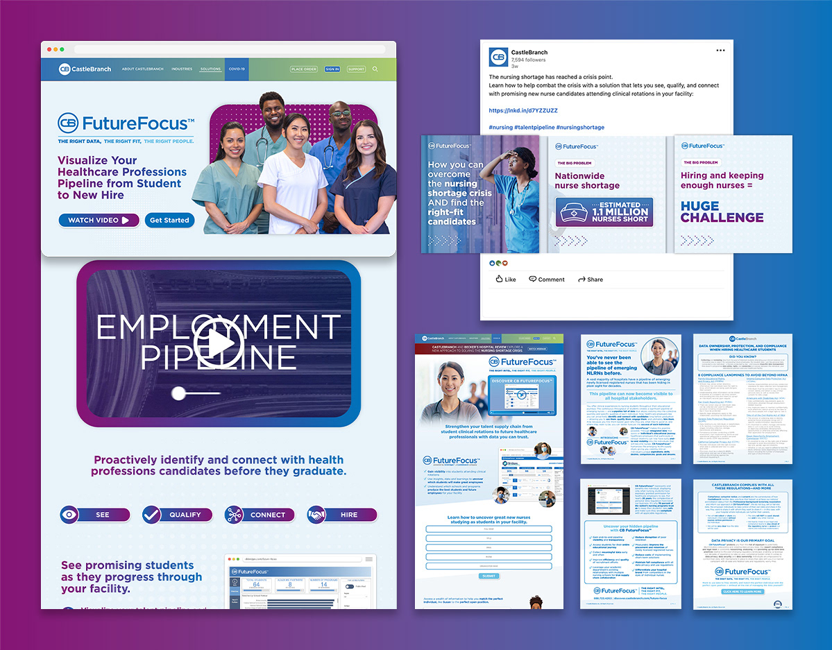
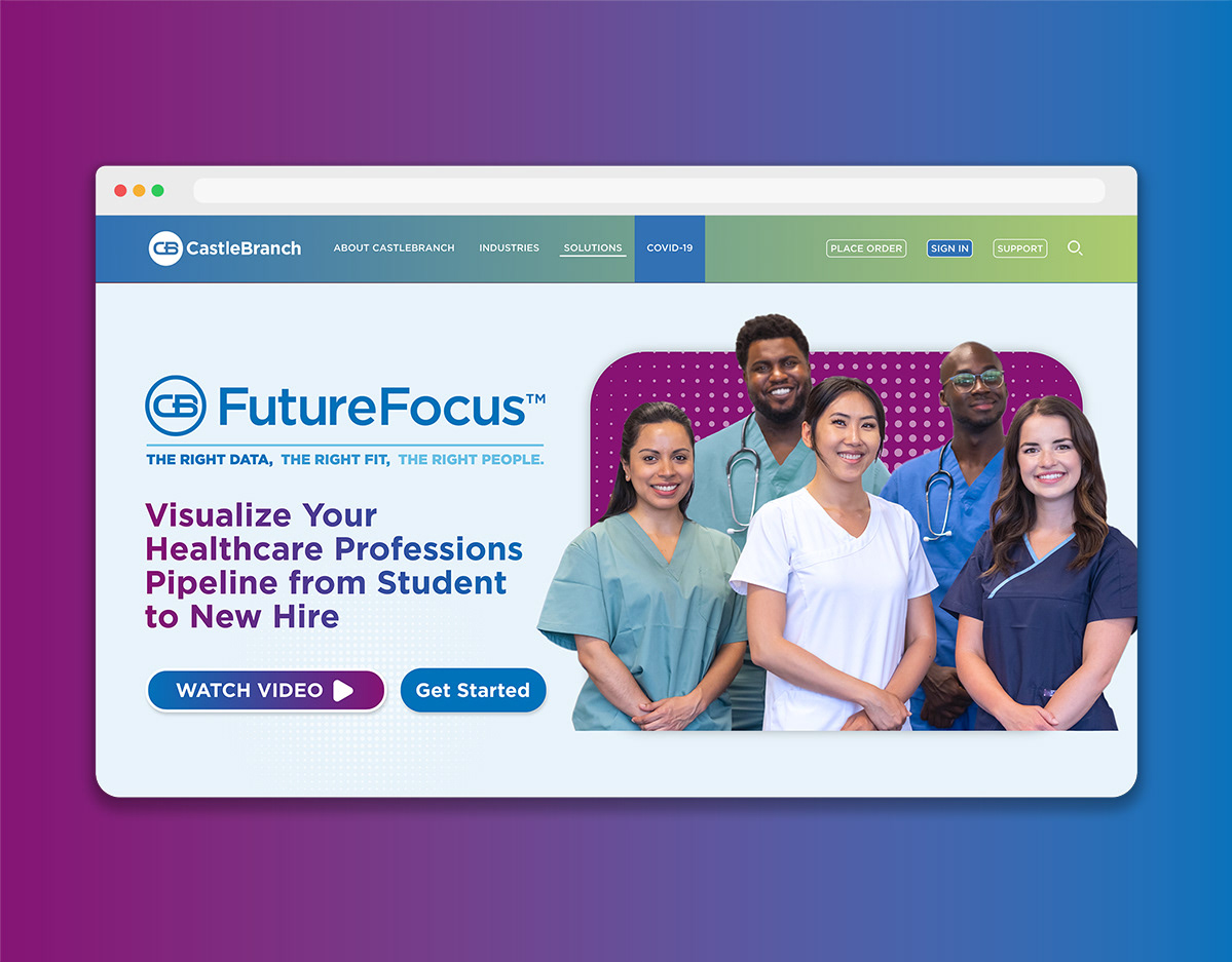
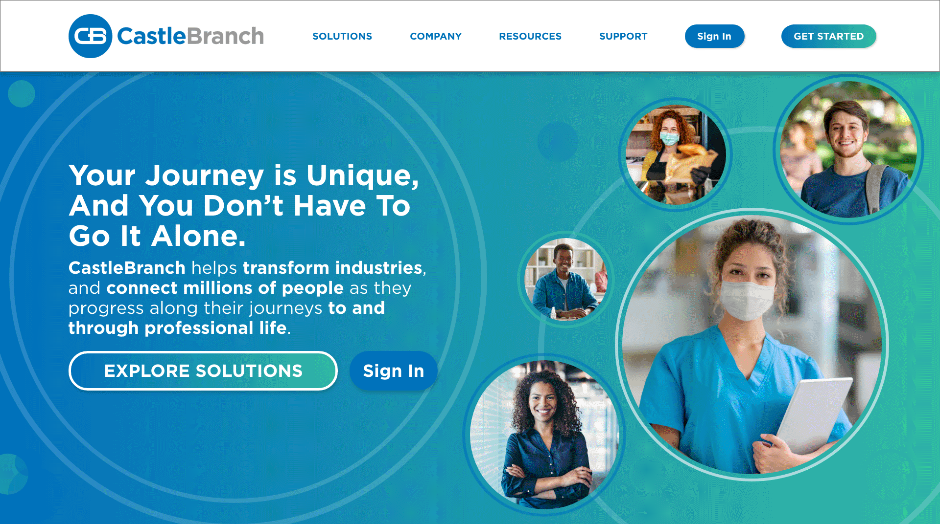
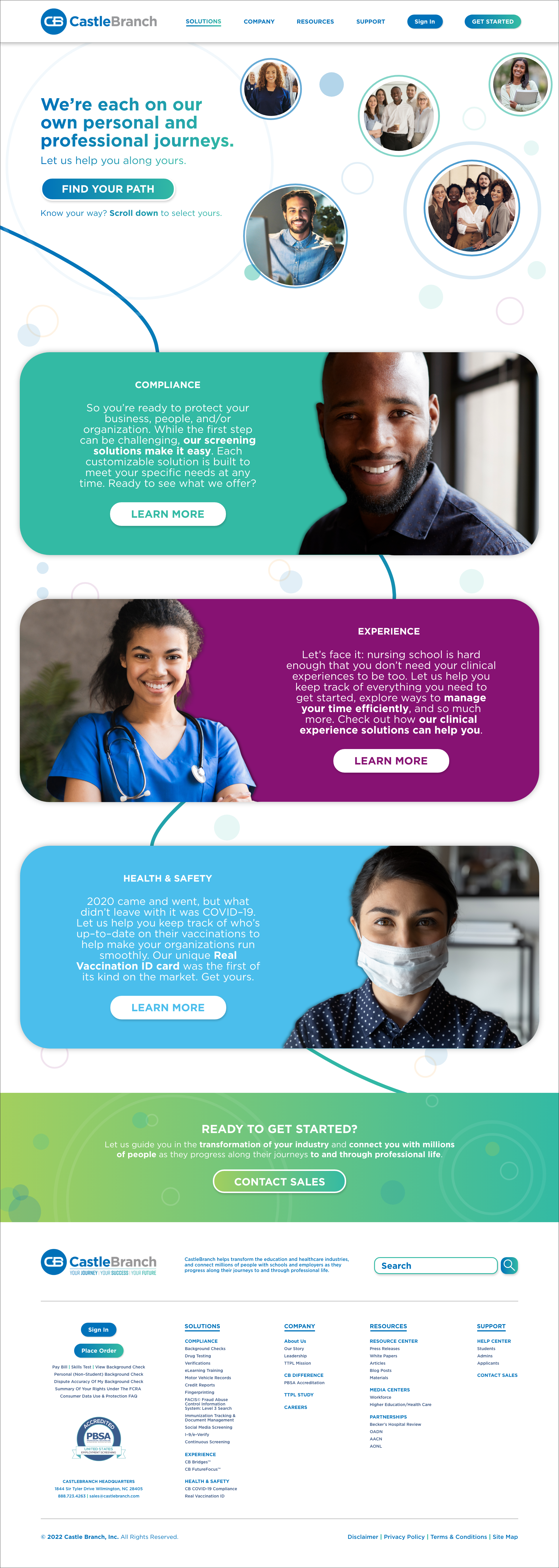
The redesigned website establishes a people-centric approach through selected imagery and written tone. I reinforced the user experience to keep the individual at the forefront. Some key elements incorporated into the design to achieve this include: clean navigation, direct CTAs, an expanded brand color palette, and organic and geometric design elements which help guide the user through the content.
I opted for self–selection features within the site to enhance the user experience further. This allows the user to navigate on their own through solutions or get started by taking a short pop-up questionnaire to better direct them to customized information.
The new design will increase site traffic and page views, reduce bounce rates, allow for more conversions, and limit the number of redirected support calls.
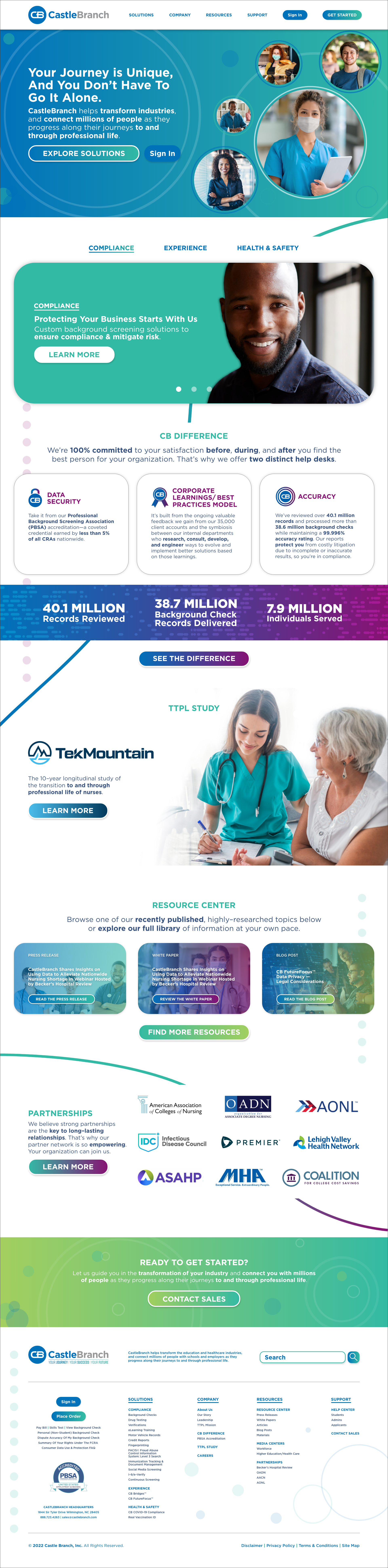
CastleBranch Solutions page

The final version of the redesigned site is completely responsive and implements a strong user–centric experience to help simplify the process of finding custom solutions. The header space is designed to easily allow users to explore solutions further if they are not yet a customer or to sign in if they are an existing customer. The experience is designed to guide individuals to the solution that's the best fit through a short questionnaire that overlays the homepage by selecting the button to "Explore Solutions".
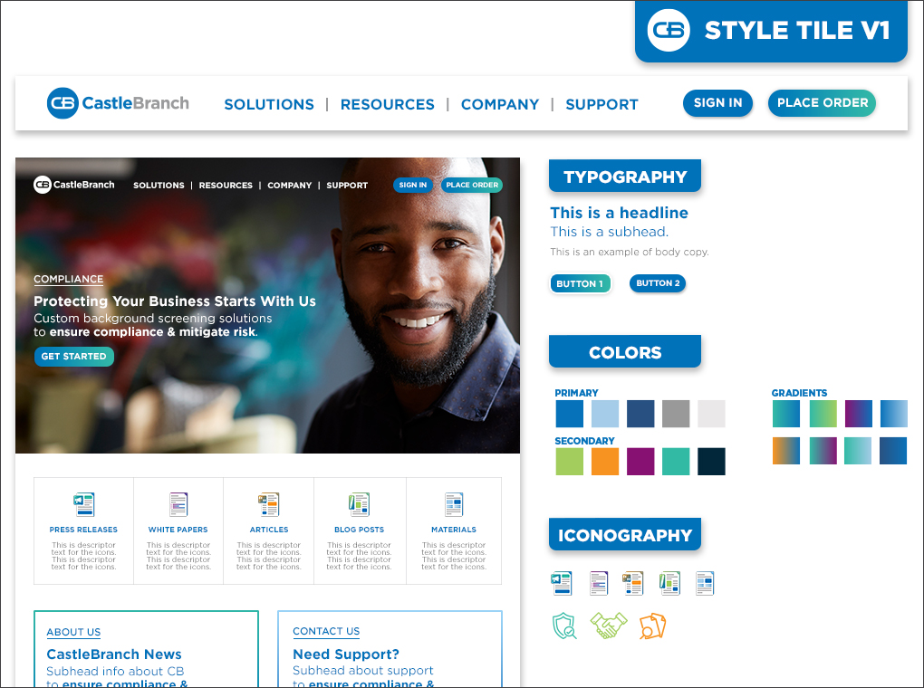
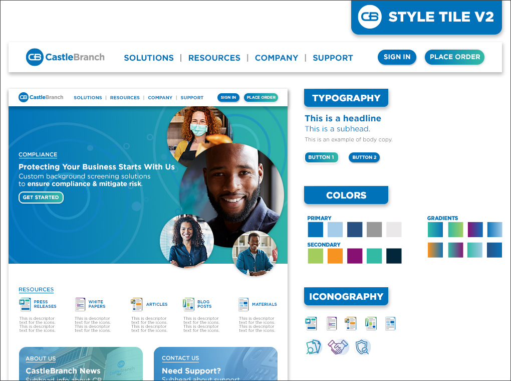
Concepts: I created various style tiles to help establish a consistent look and feel for the site redesign. Both options use geometric shapes and similar color palettes, but version 1 features full–width header imagery and a stackable modular layout.Version 2 creates dimension through layered imagery and shapes leading an individual's eye down the page.
Impact Report
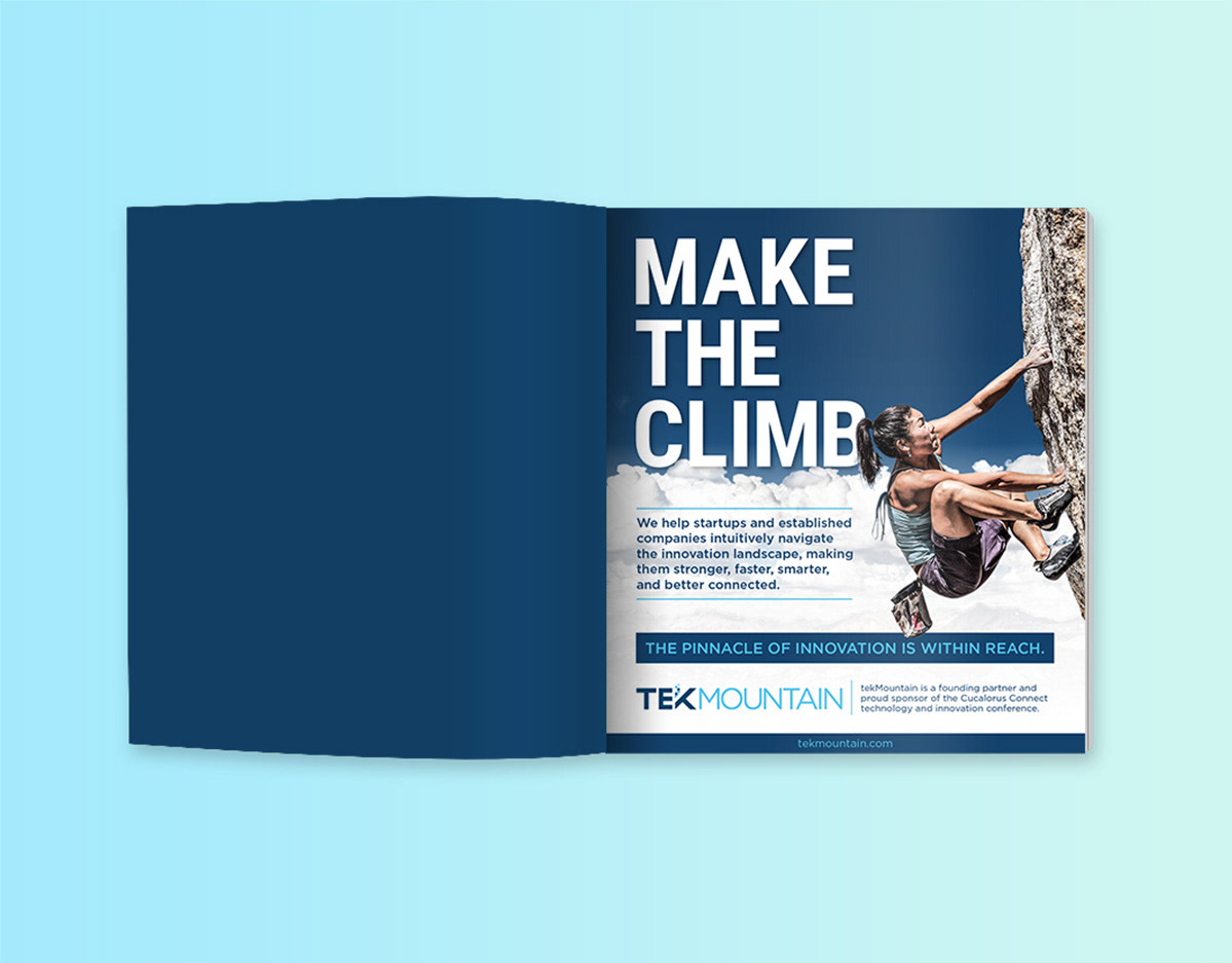
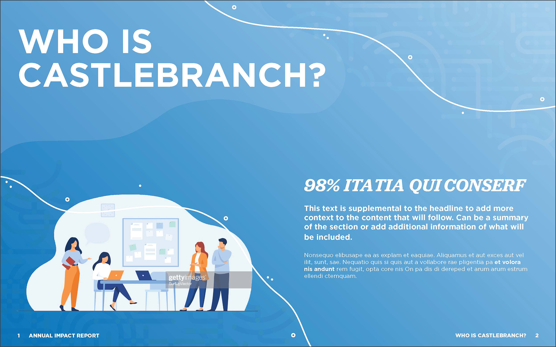
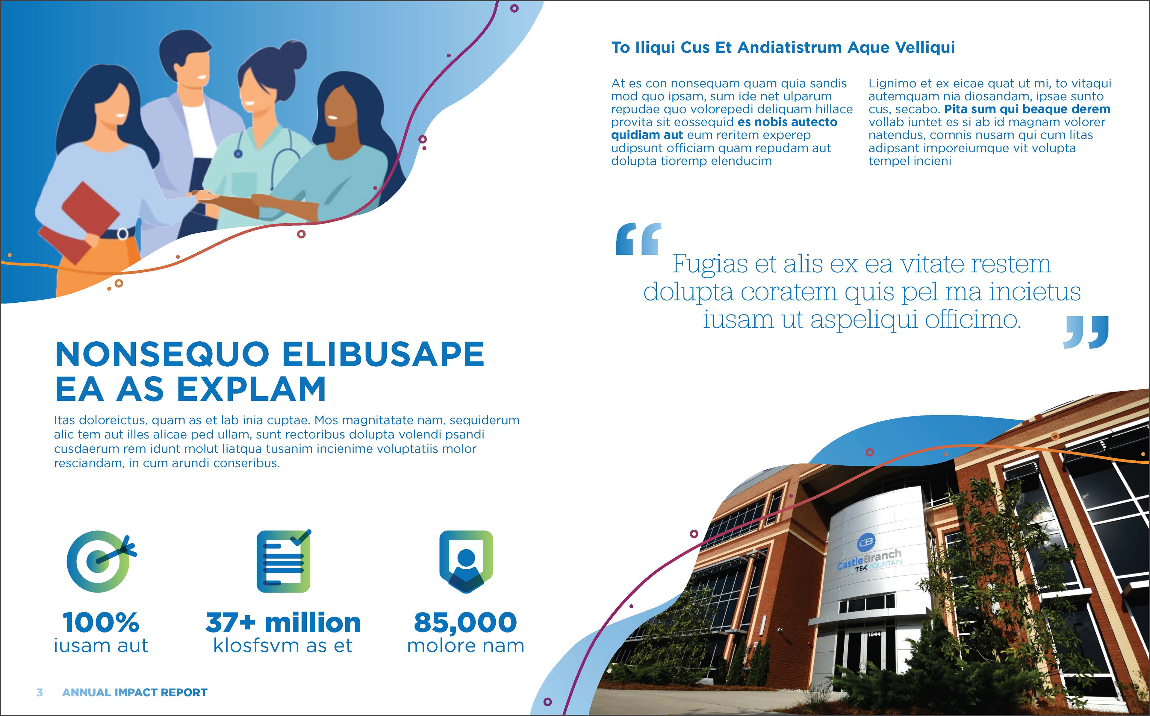
The first annual Impact Report for CastleBranch is a comprehensive publication highlighting how they help 8.6 million people and thousands of organizations along their professional journeys.
The creative goal for the Impact Report also focused on implementing people–centric elements. Through this team effort, copywriters focused on continuing the people–centric theme through written tone. I collaborated with and led other creatives from a design perspective to establish an easy–to–read and inviting publication. We achieved this through expanding the brand standards, selecting personified imagery, establishing color coordinated sections and creating dimension through layered elements.
The CastleBranch Impact Report was distributed digitally and in print format to potential, new, and existing clients as well as to internal team members. I communicated and collaborated with multiple print vendors to assemble printer spreads and provide specs required by each to ensure the deadlines were met on time.
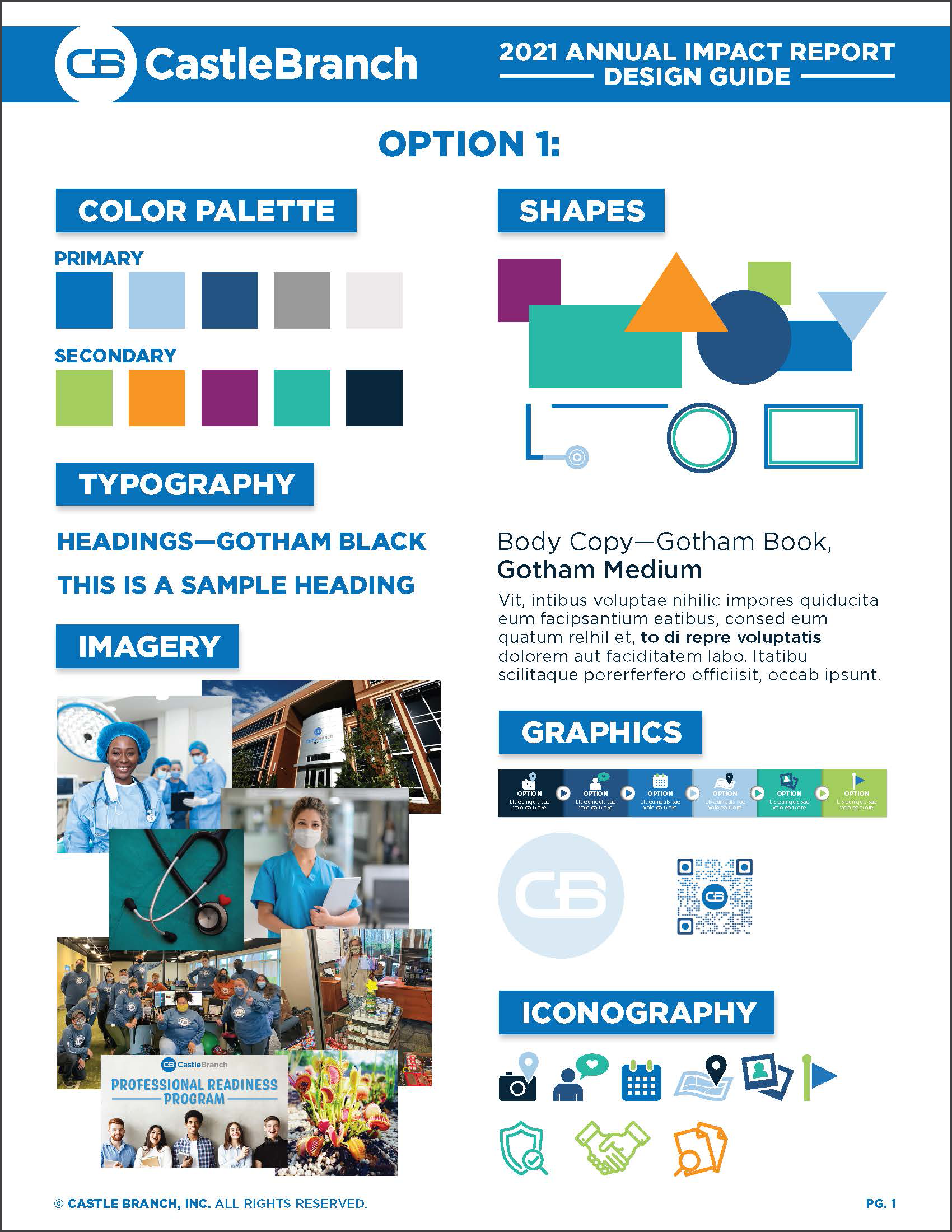
Concept Option 1: The first option of the design approach for the Impact Report included geometric shapes, a solid color palette, full–bleed imagery, large/bold typography and various layered elements to establish a clean, structured, and uniform layout.

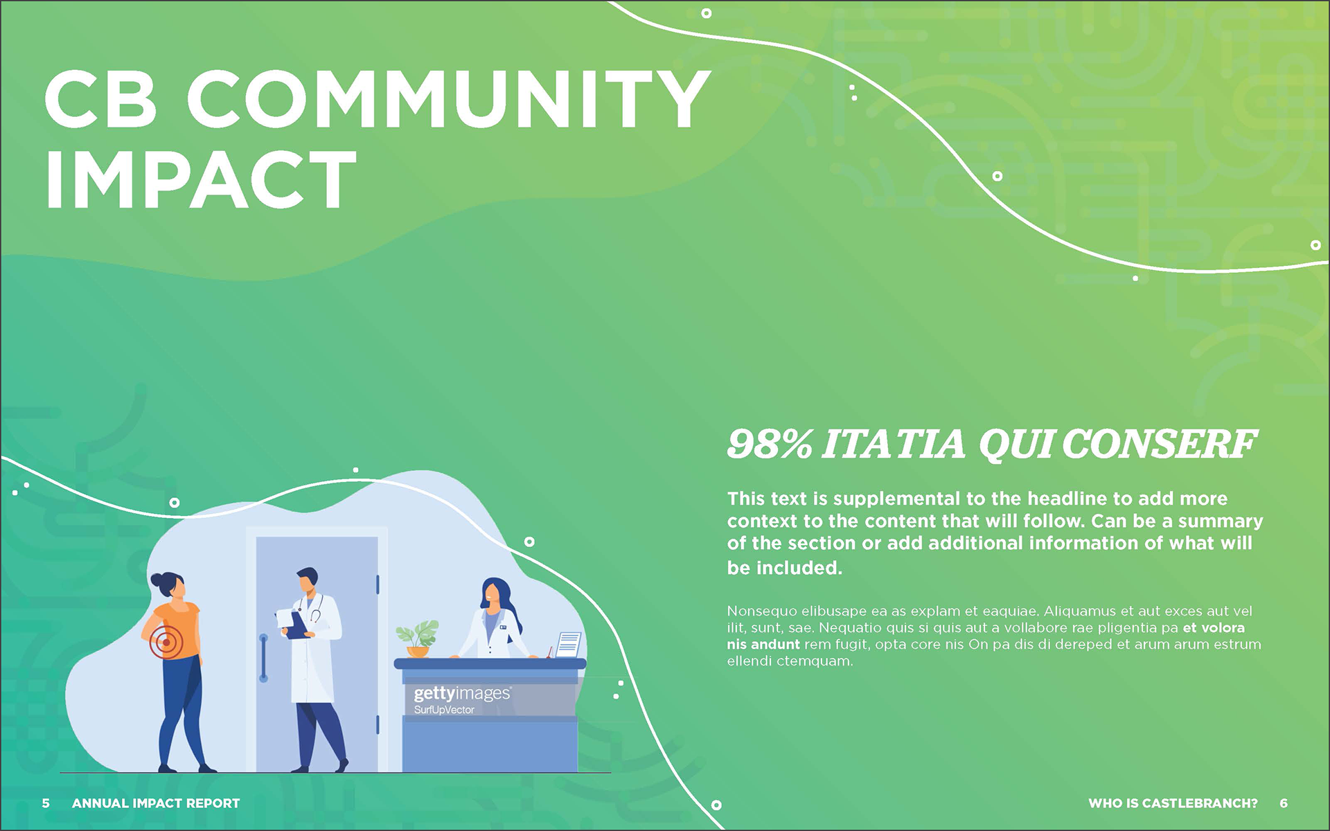

Concept Option 2: The second option (created by another designer on the team) implemented more of a fully organic approach using thin lines, solid and gradient color palettes, layered opacities of shapes, imagery enclosed in organic shapes, and more to help create an airy, free–flowing layout.
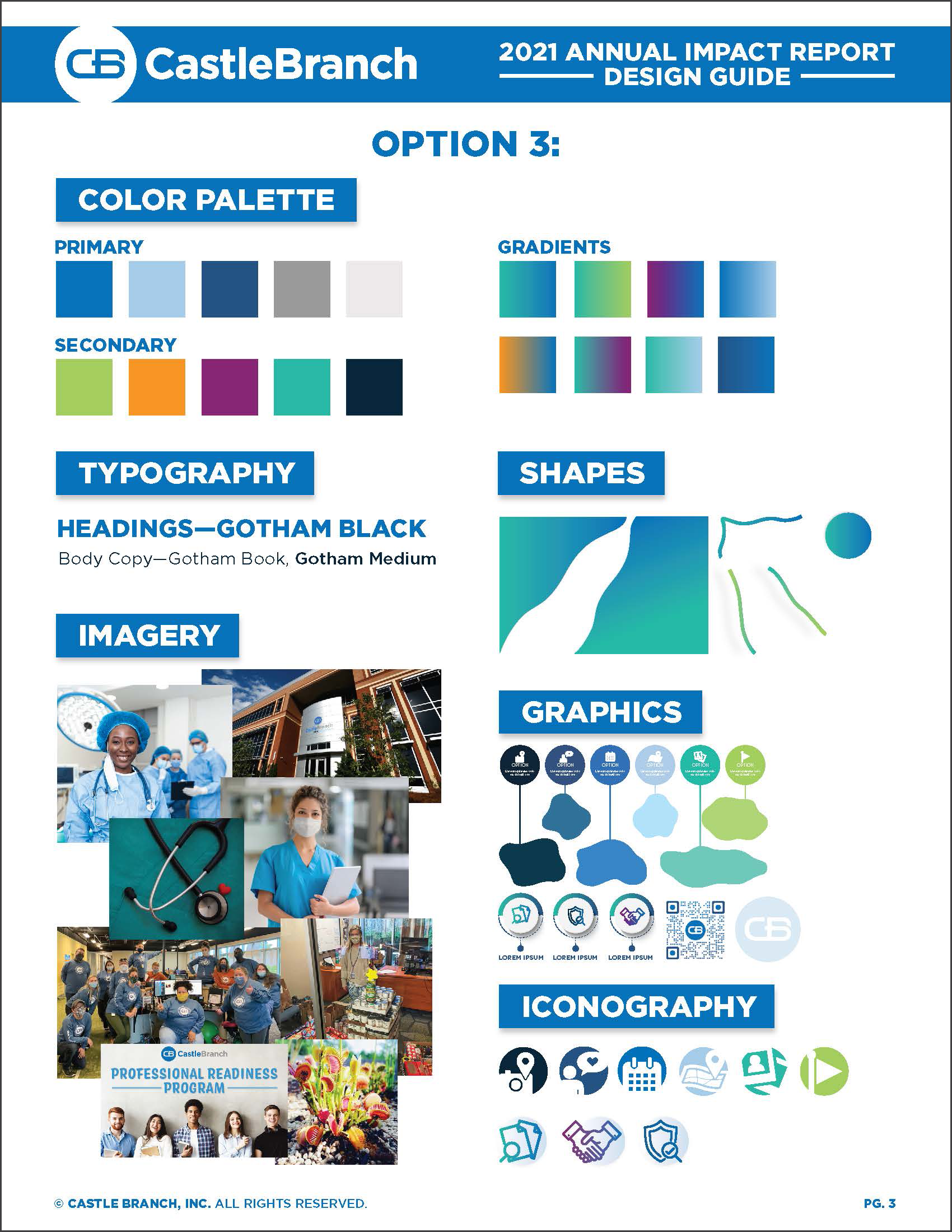
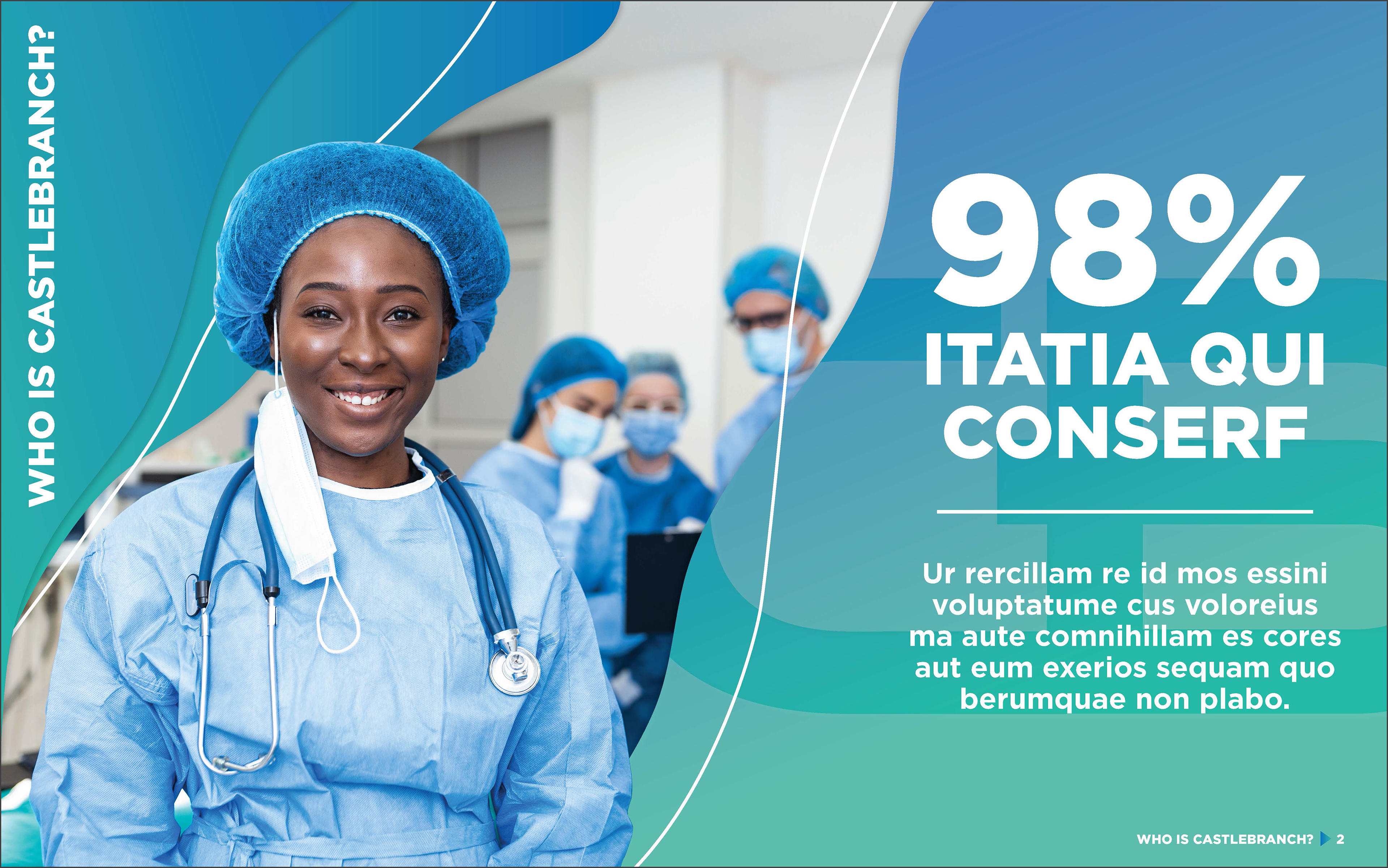
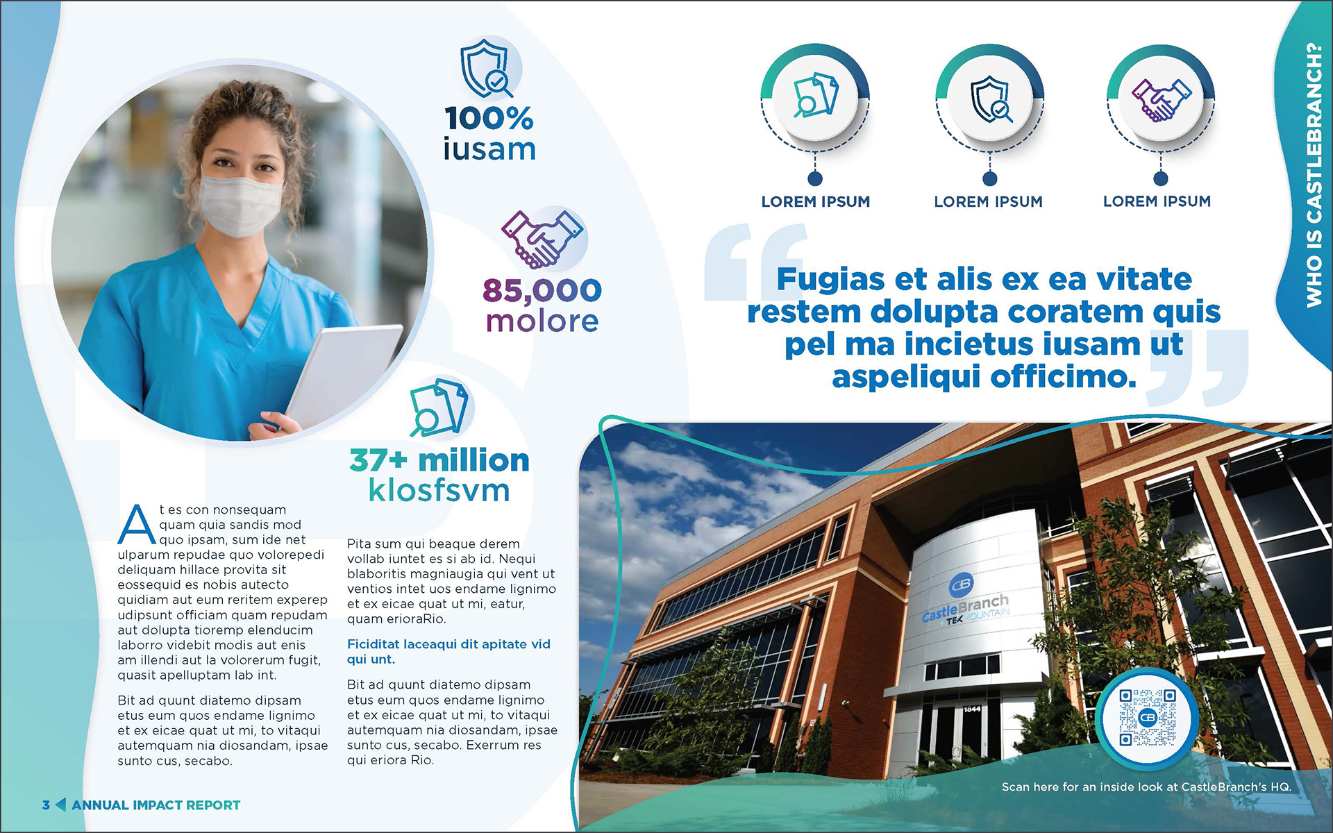

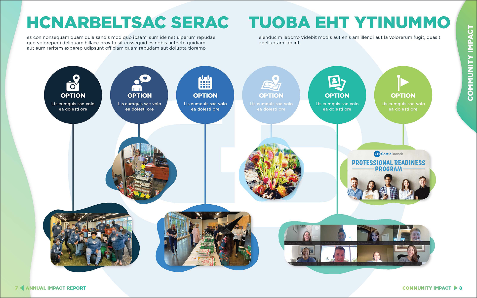
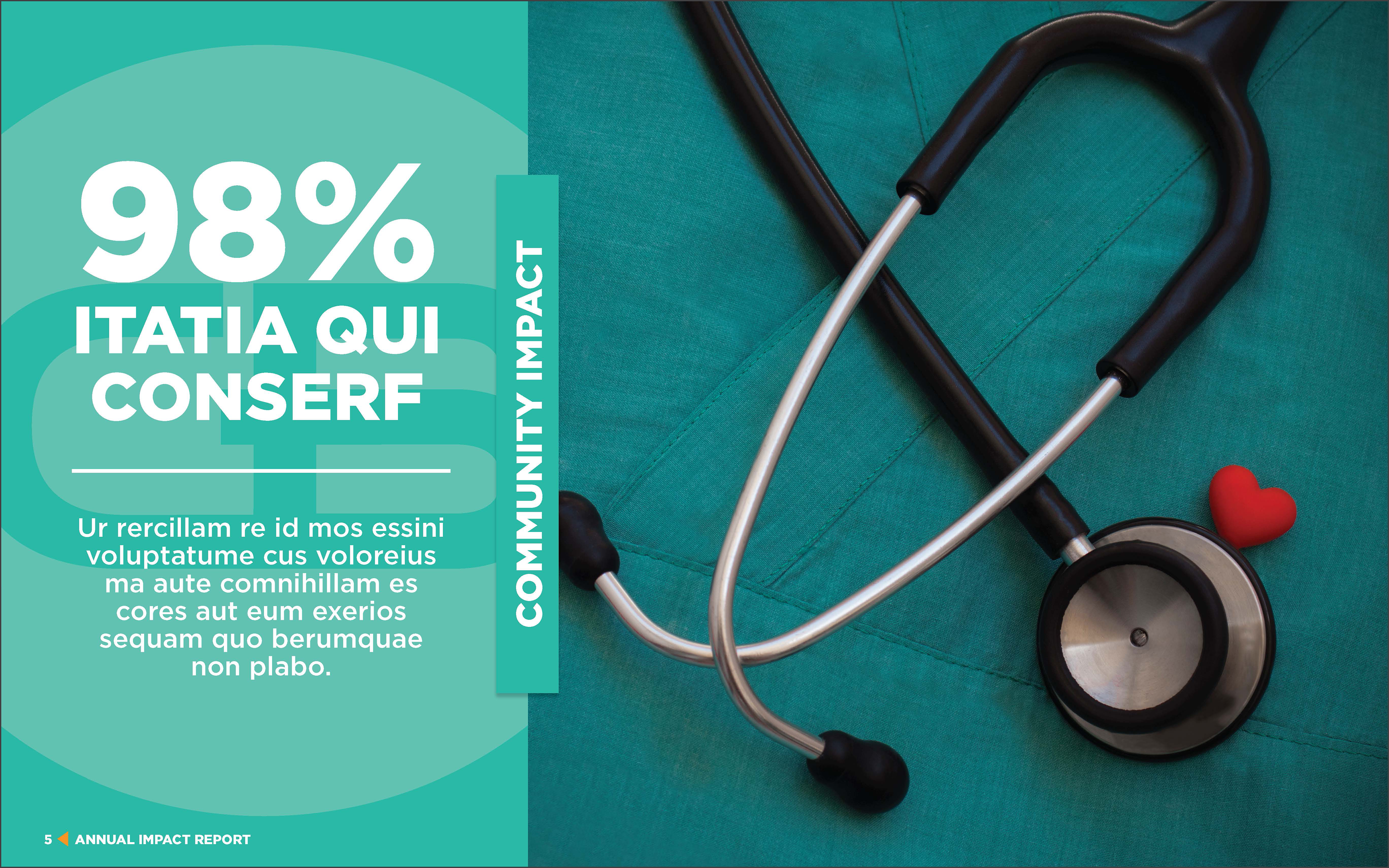
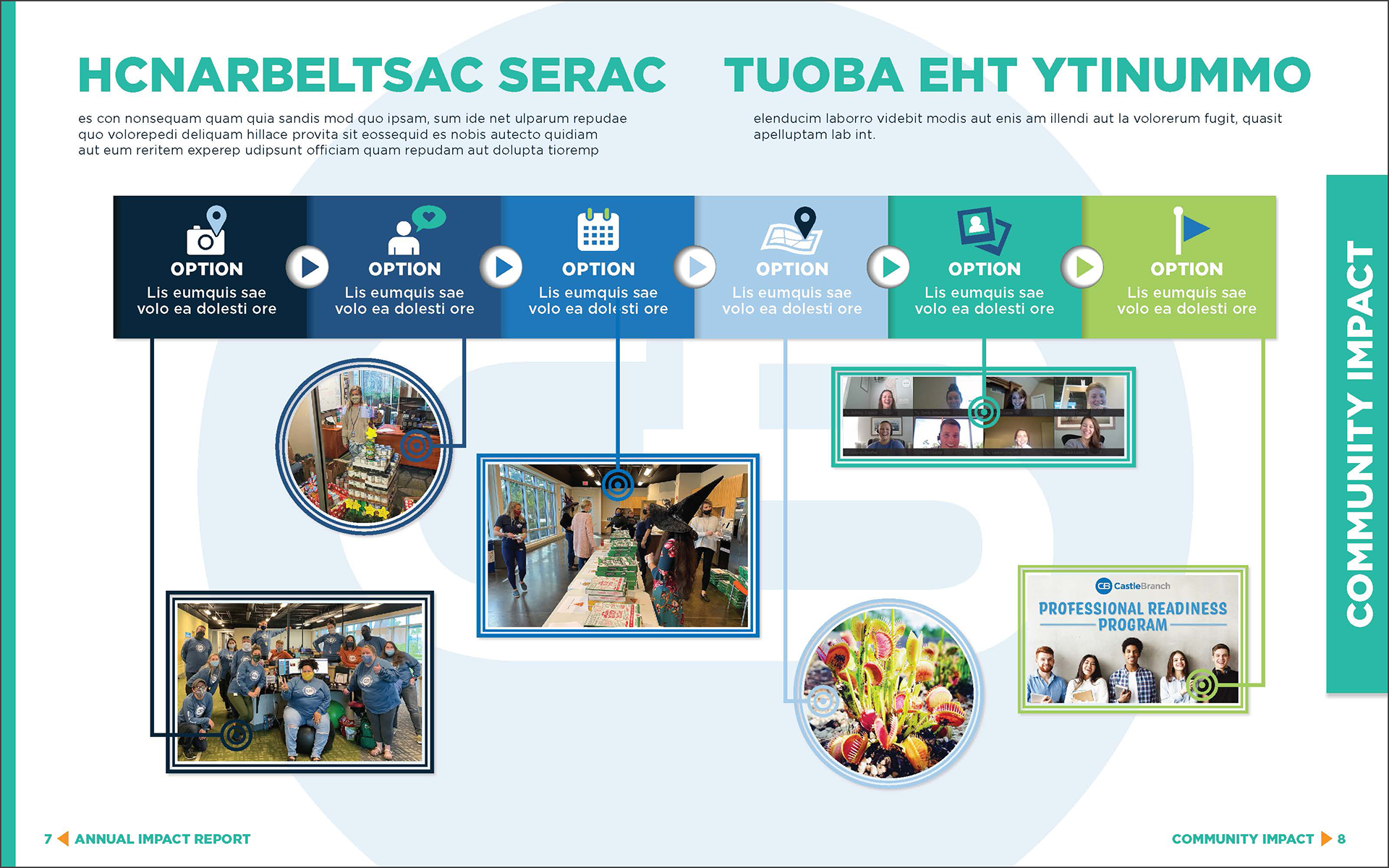
Concept Option 3: The third option for the Impact Report (and selected option) is a refined combination of the Options 1 and 2. We combined organic/free–flowing elements with geometric shapes and the gradient color palette to coordinate and guide the reader through the booklet. We took advantage of selecting people–centric imagery with complimentary color palettes to each section dividers and layered areas of the imagery over the organic elements to convey a more dimensional atmosphere.