CB FutureFocus™ is a unique, healthcare industry-leading tool developed by CastleBranch to connect the pathways from healthcare education to healthcare employment. The tool provides insight to potential employers of nursing students' educational journeys to help find the best fit for their organization.
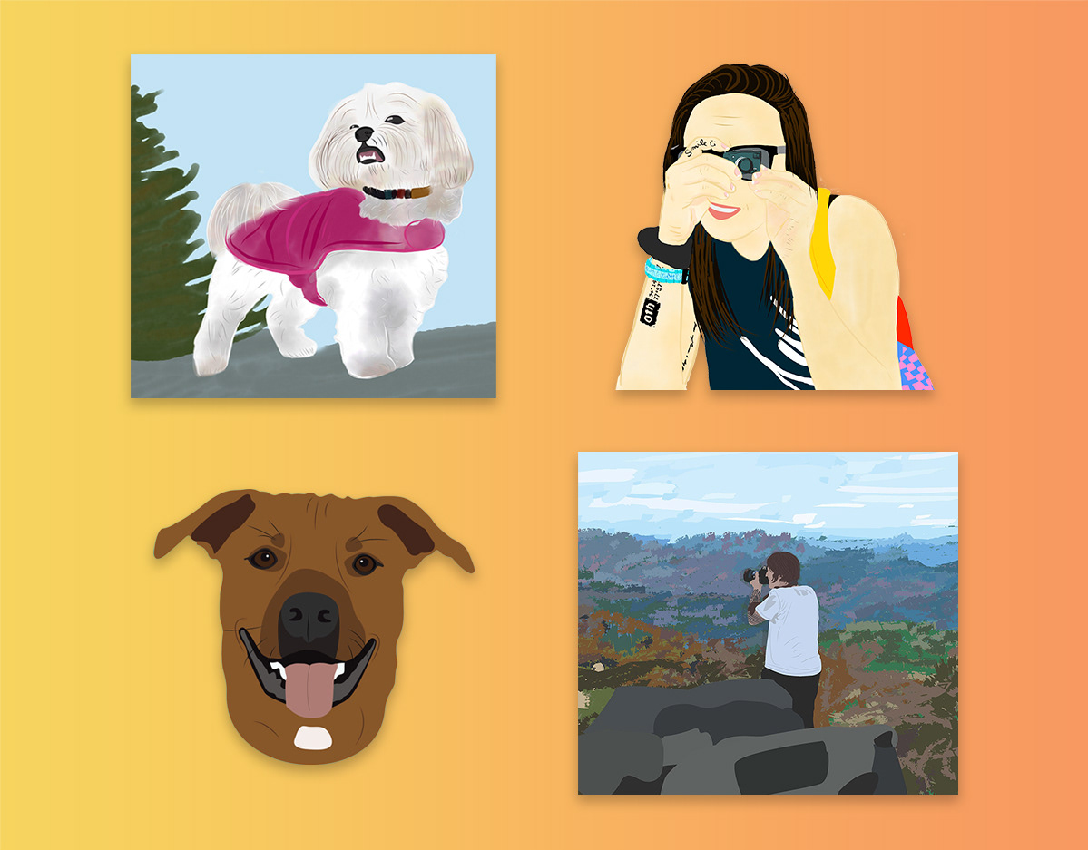
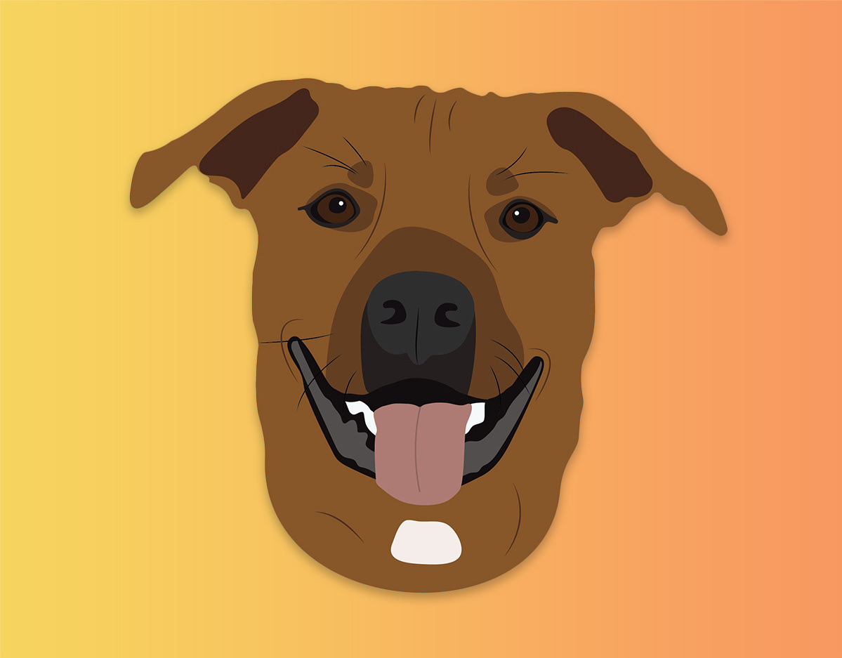
I conceptualized and designed materials for the B2B campaign to promote CB FutureFocus™ such as sales sheets, overview landing pages, and social graphics. The first version of the campaign began with creating a character persona to portray a nursing student's journey through education to employment. The vector–based persona realized the journey into a first–person perspective that I was able to expand on throughout the materials. I created a scrollytelling landing page design and mocked up stylized versions of the platform.
The second version of the campaign involved transitioning away from the vector–based persona and to a personified approach. This approach included people–centric photographs of nursing professionals. I also incorporated iconography to represent key features and benefits of the tool. This evolution of the campaign helped establish personable connections and increase client engagement and sales.
Landing Page + LinkedIn Carousel Post
For the second version of the B2B marketing campaign of CB FutureFocus™ (a tool used by hiring organizations/individuals to find the best candidate early on in the candidate's journey to professional life), I focused on maintaining CastleBranch's goal of featuring people–centric imagery.
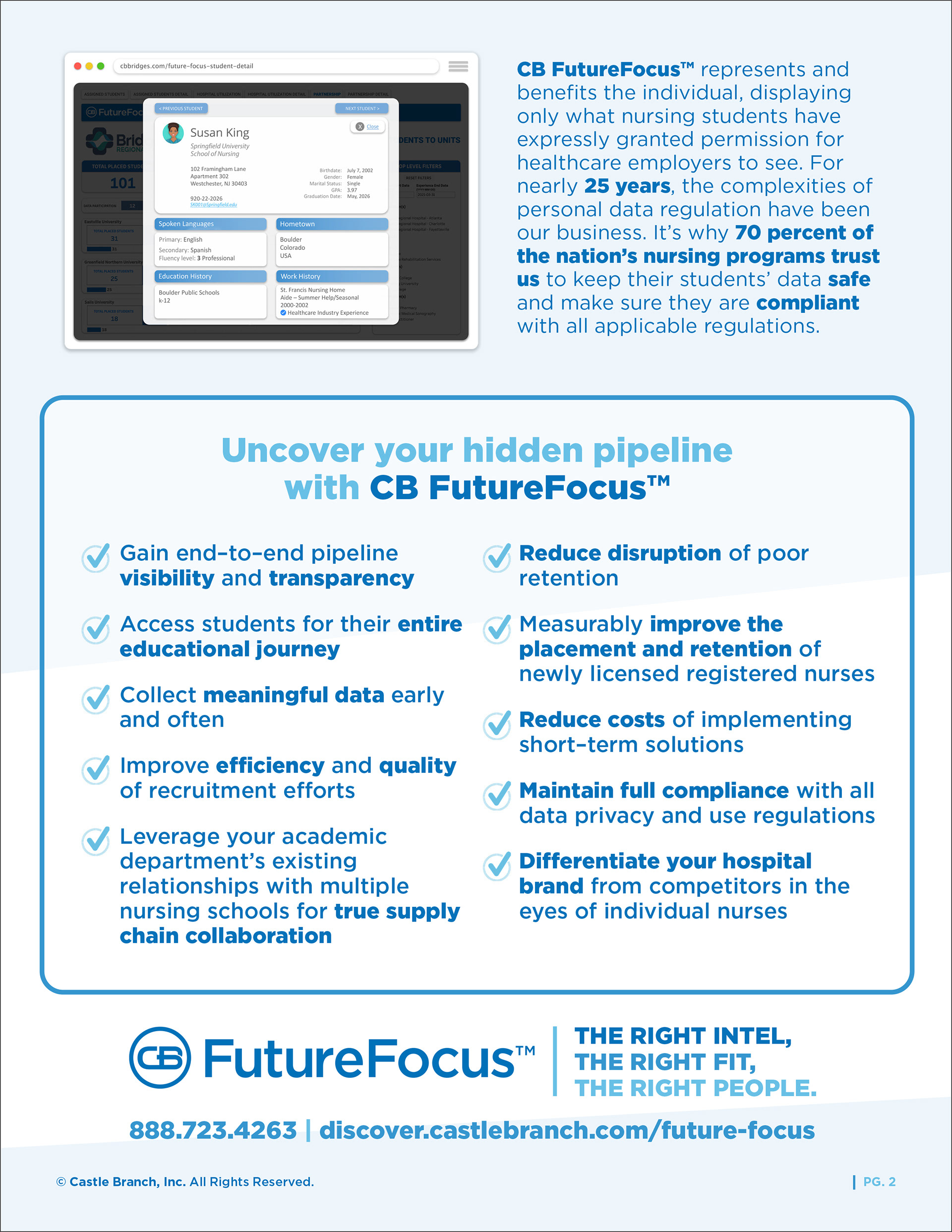
The landing page design maintains a progressional layout featuring navigational links in the header, a short overview video to follow, and a highlight of the tool's features and benefits paired with stylized platform mockups. A clean and simple form fill to encourage lead generation is also included along with an easy-to-navigate informational resource center.
The key design features used are an expanded color palette, shapes, icons, text, and backgrounds. I chose to create a light texture in the background to establish dimension and develop iconography for the four main features and benefits. The resource center follows a clean, grid–based layout for organization and easier navigation. As the deadline approached for this landing page, I worked in conjunction with the in–house web master on the front–end development in WordPress.
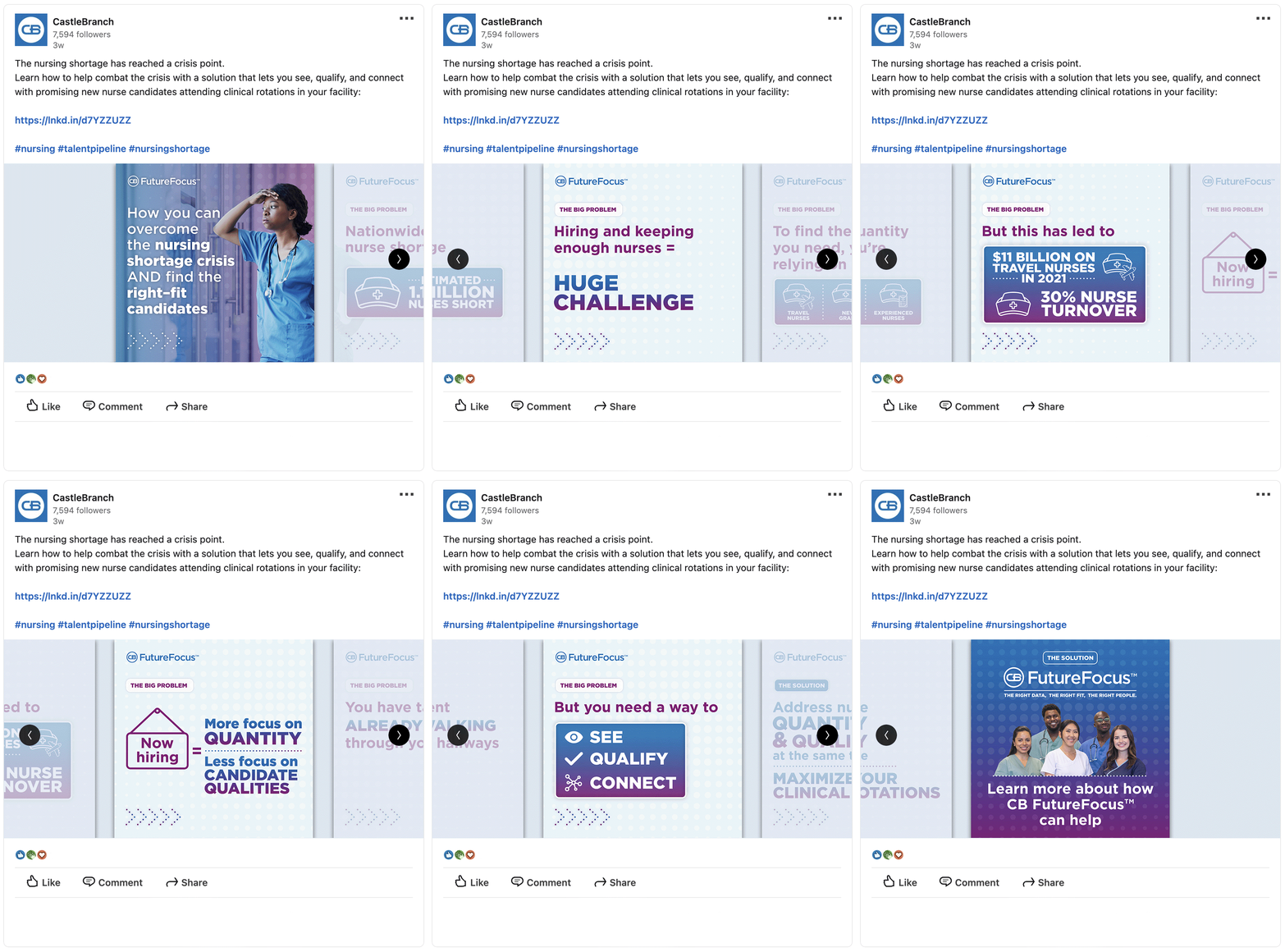
Another component of the B2B campaign involved creating a social post in the carousel format for LinkedIn. I transitioned the pre–established design elements for CB FutureFocus™ into the design of the carousel post to help create a unified brand for the tool. As a graphic for a social platform, we chose to keep the information clean and concise to capture attention and increase engagement. I used bold typography, infographics, and iconography from the landing page to connect the two environments.


Web + Print Marketing Materials
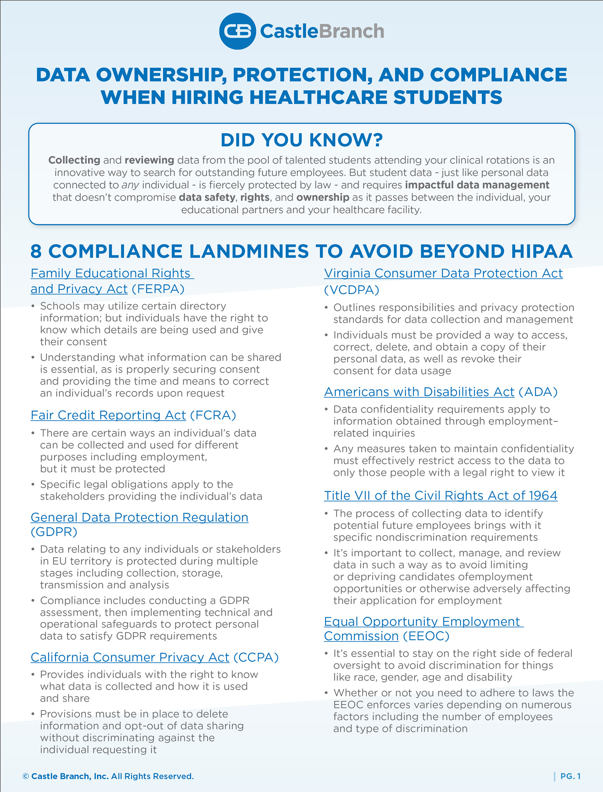
The original introduction of CB FutureFocus™ into the market was as a talent supply chain tool. I helped create marketing materials and landing pages as part of the first version of the campaign to support the internal sales team.
The tactic for the first version focused on portraying a nursing student's journey through a character persona. The original concepts incorporated vector–based graphics, scrollytelling page functionality, and a cool–toned color palette to create a clinical design aesthetic. As we reworked to a simplified, long scroll landing page, we began incorporating people–centric photography to create a personified experience.


