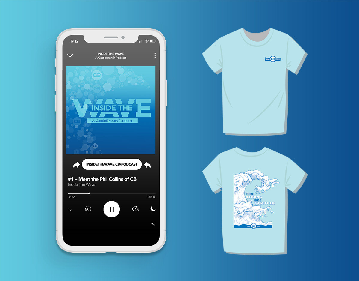
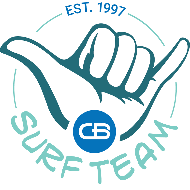
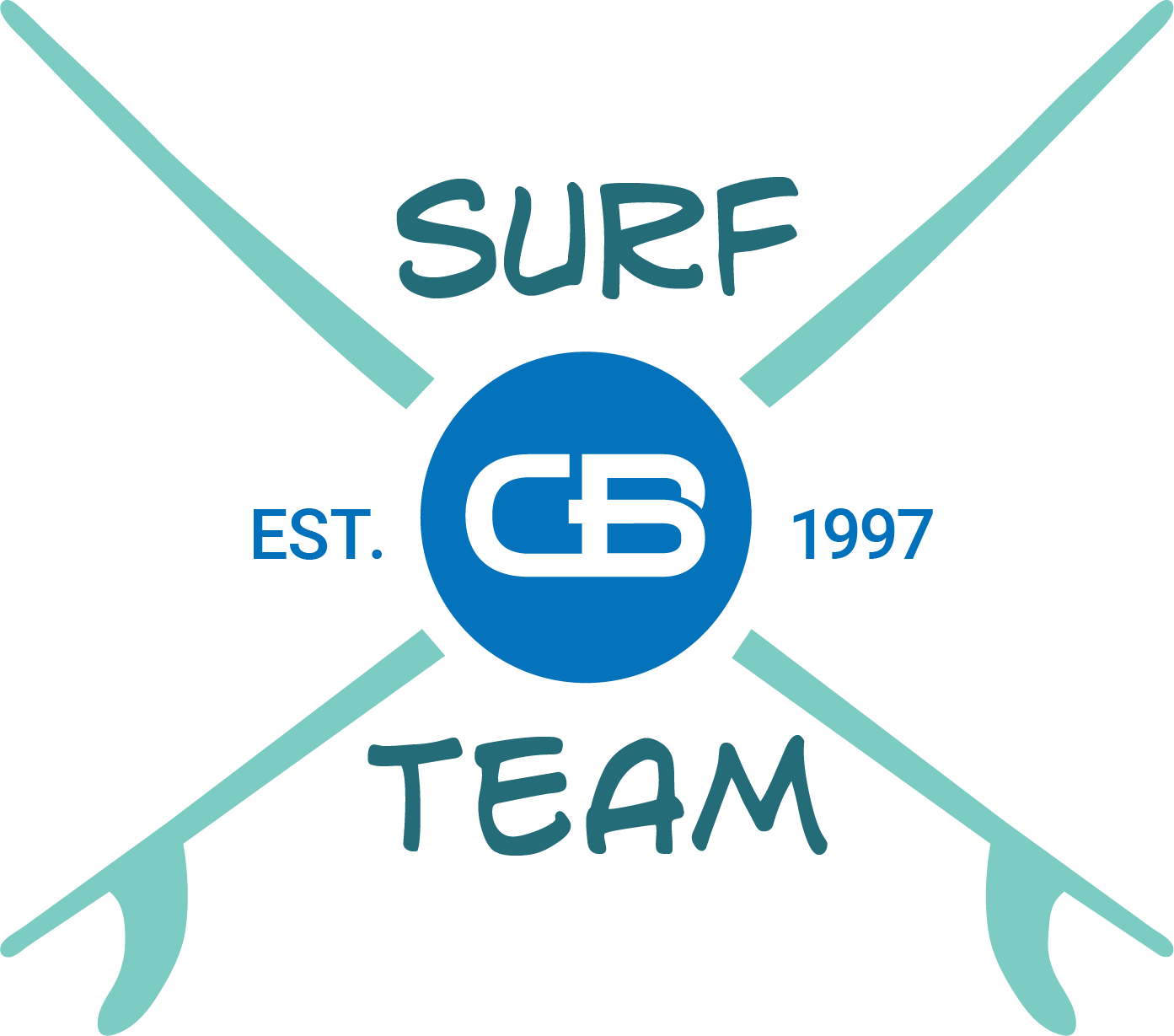
"Ride the Wave" was the slogan for past years' internal "Wave" campaigns at CastleBranch. Ride the Wave relates to the surfing analogy of not fighting the wave, but rather moving with its natural tide. That's exactly what CastleBranch encourages internal team members to do during Wave. They support and boost company morale by celebrating their efforts and equipping them with the tools needed to succeed. I chose to connect the typographic treatment with a surfboard to represent the tool aspect in a symbolic way.
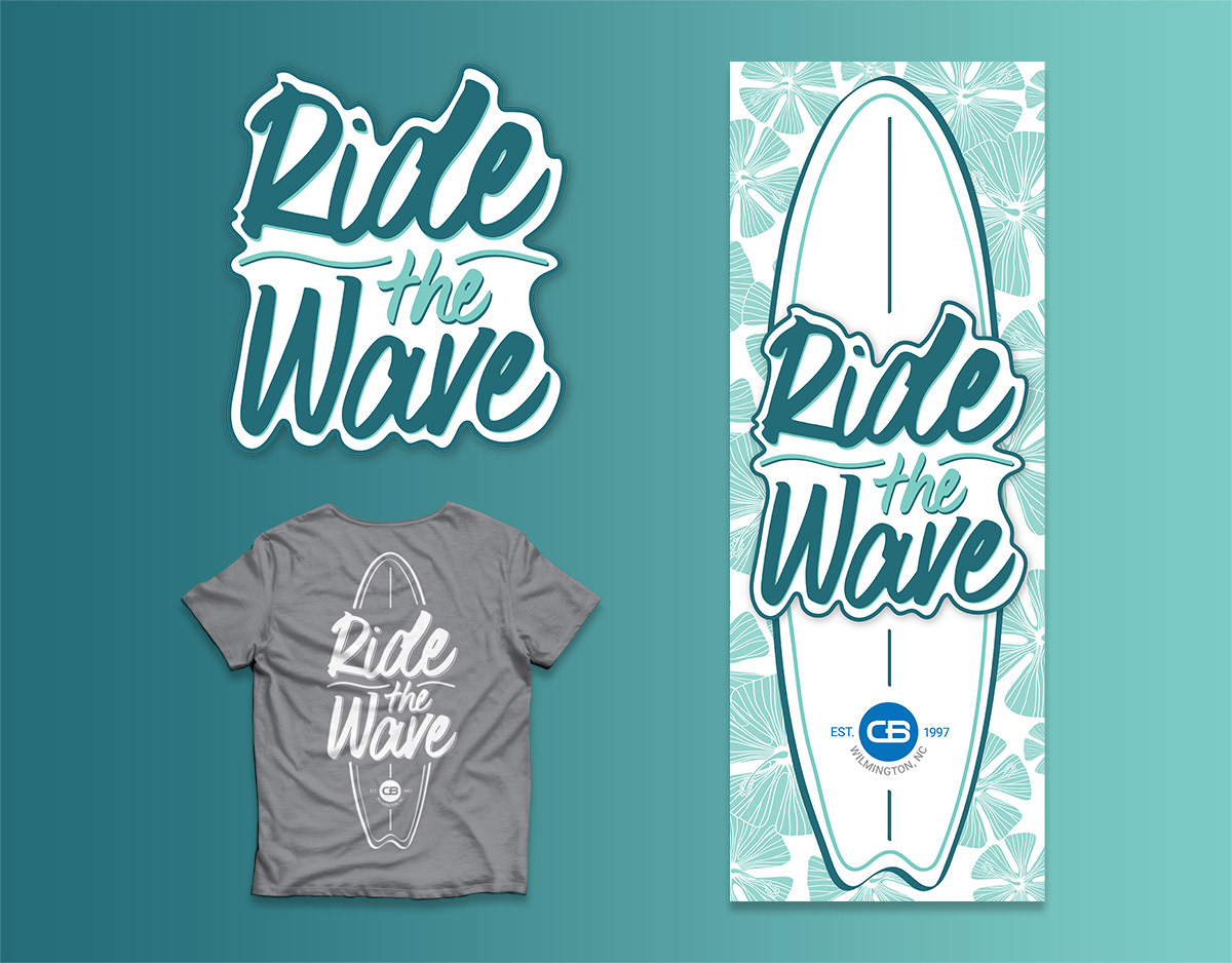
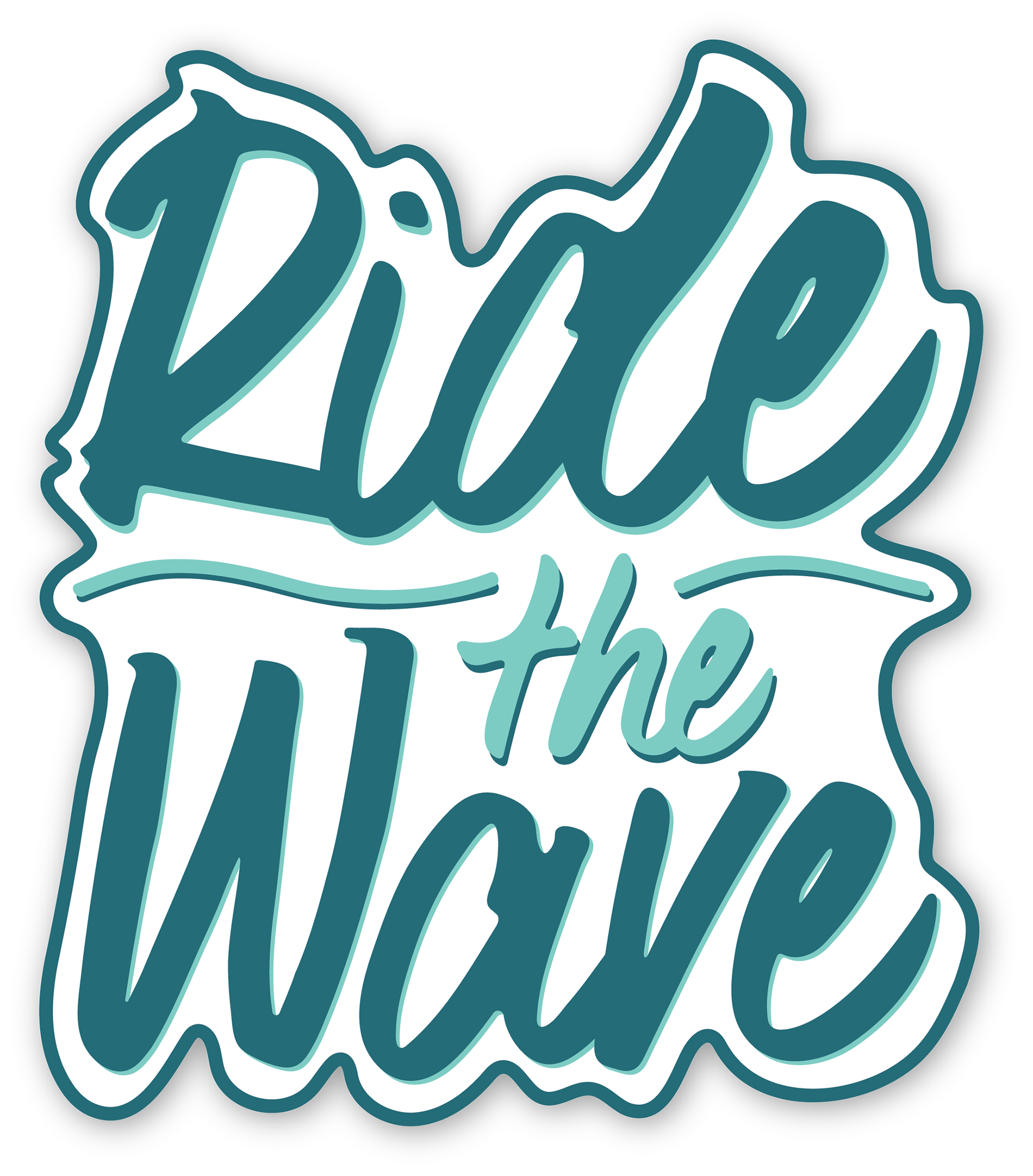
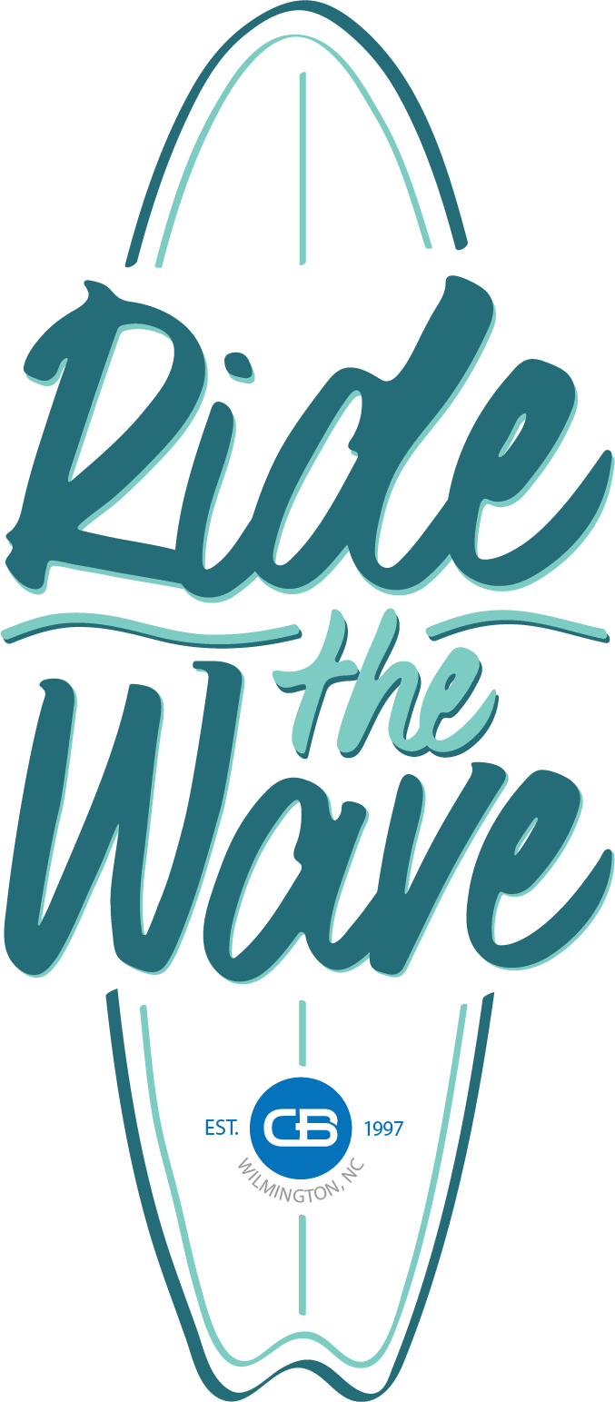
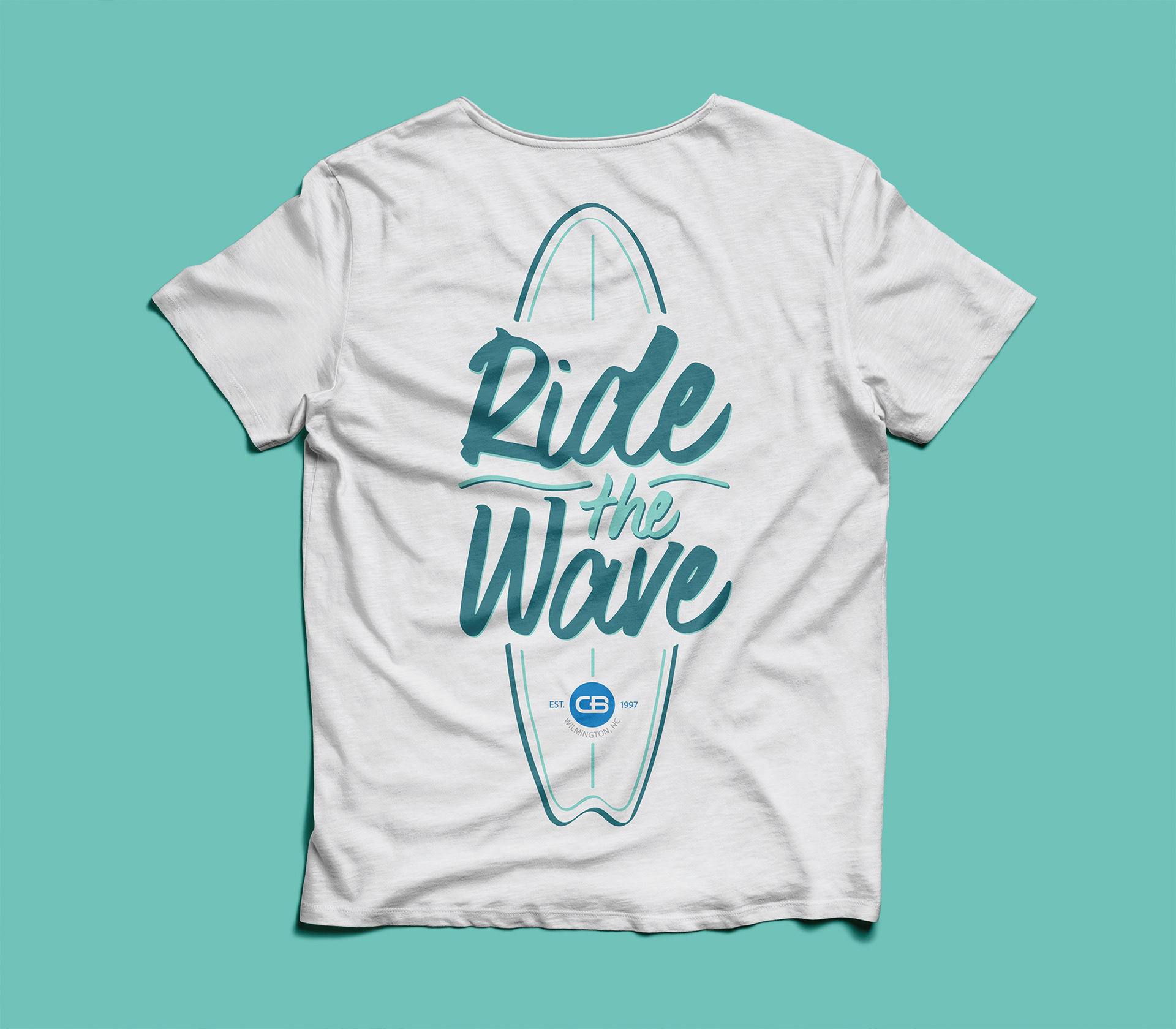
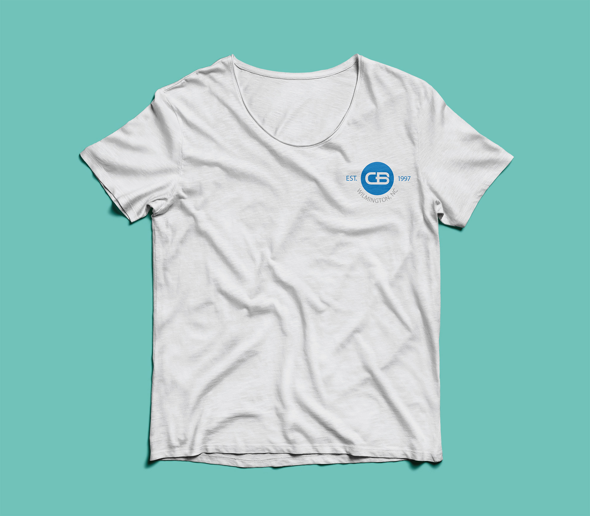
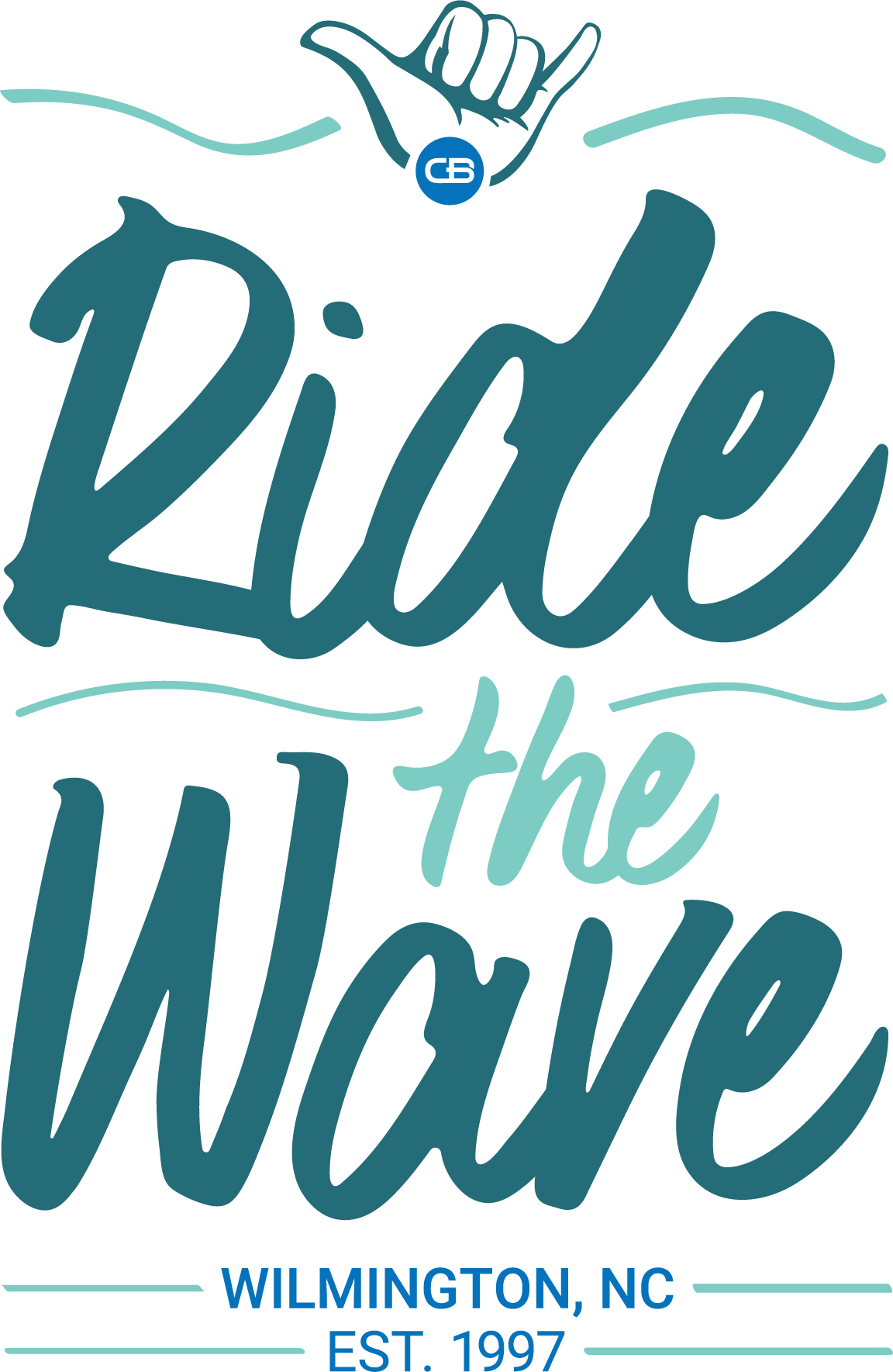
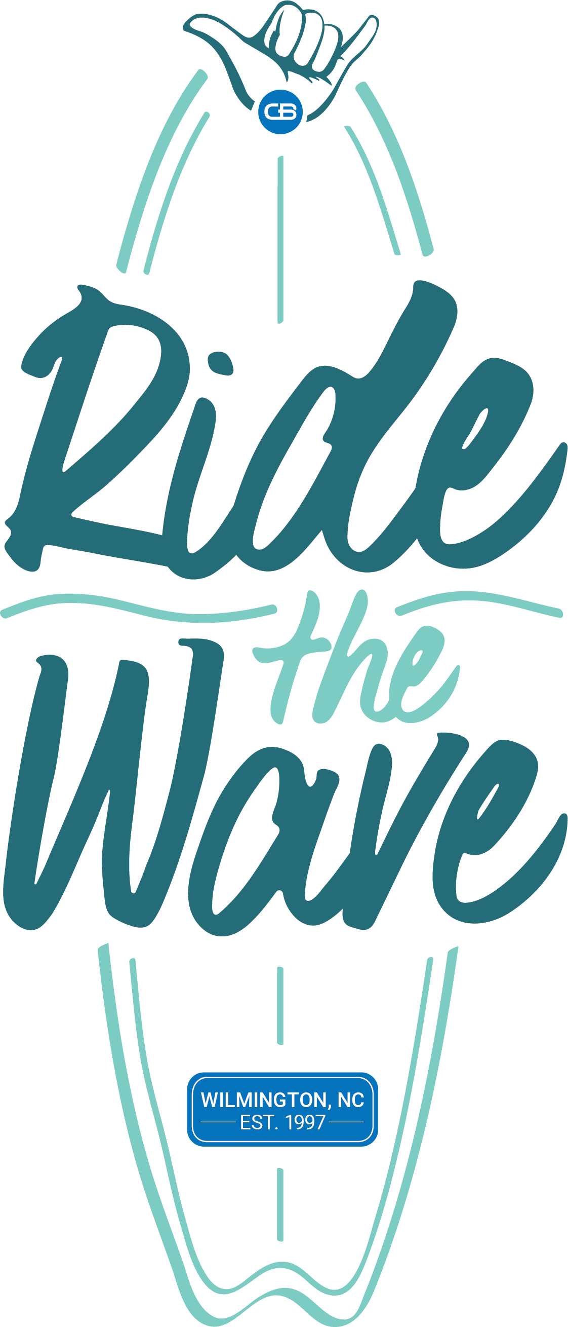
Concepts: I created the Ride the Wave typographic treatment as a handwritten sketch. After converting it into a digital format and refining it, it became a strong, layered wordmark. The versatile design could appear as a sticker design, t-shirt graphic, web graphics, used on print materials, and so much more. I was able to expand the design of the wordmark to pair with an organic surfboard illustration. This allowed for the design to become an iconic graphic that supports the annual Wave campaign. The selected color palette includes teal and seafoam colors to relate to ocean elements and is combined with brand colors. The palette and scale helped establish heirarchy within the design. As part of a two–sided t–shirt concept, I chose to implement the full graphic on the back. On the front, I created a lockup around the "CB" logomark to signify the year CastleBranch's headquarters opened.
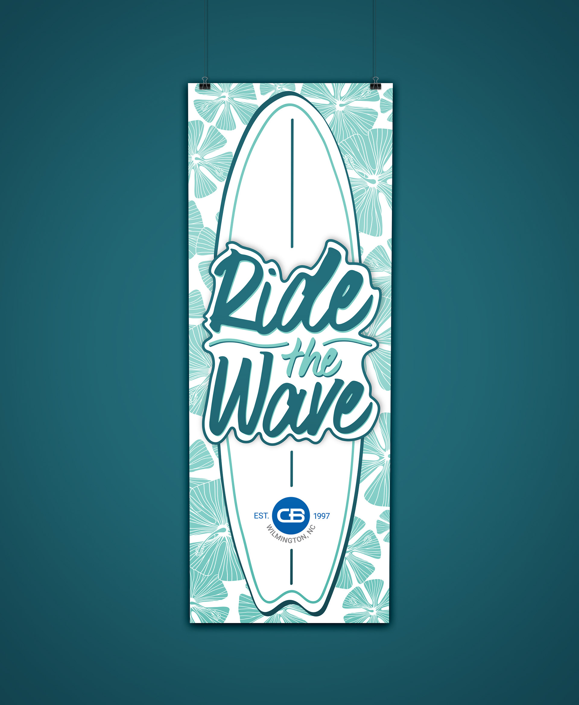

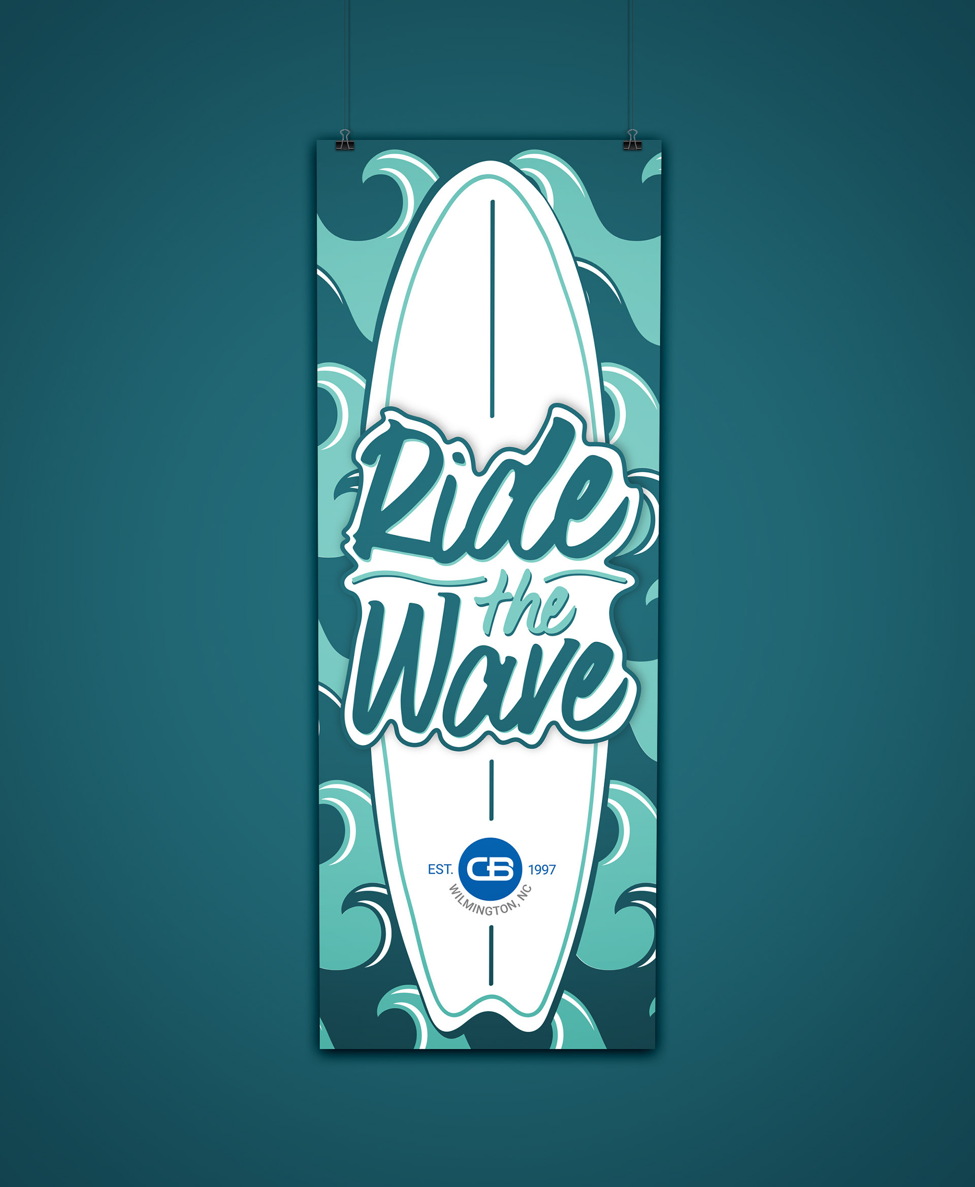


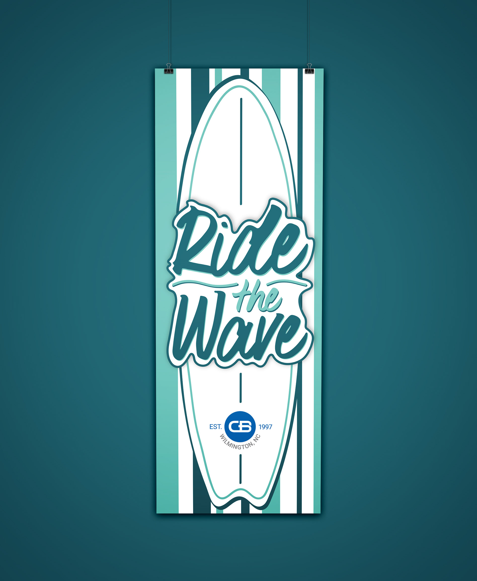
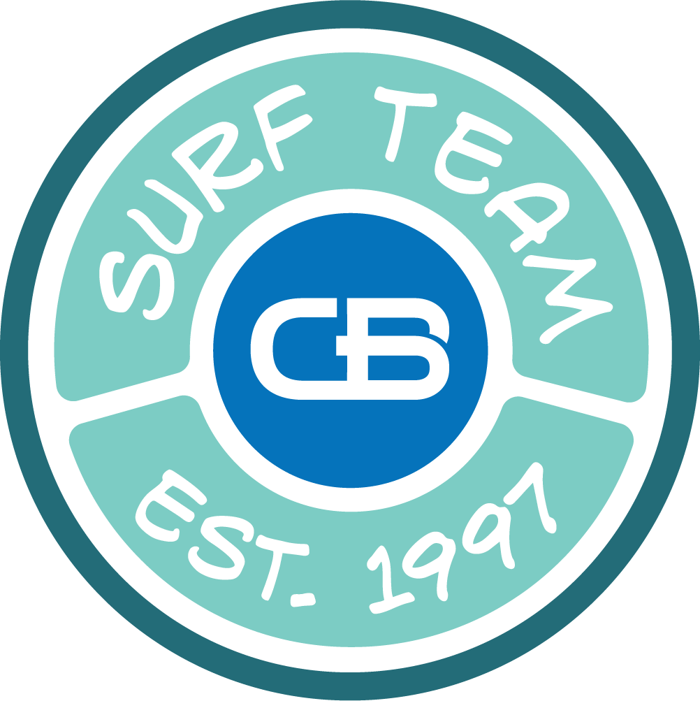
Concepts: Following the finalized Ride the Wave campaign assets, I proceeded to expand the campaign into six banner designs. The surf culture was a big inspiration for this project. I worked to incorporate various patterns found on surfboards, but with a twist. I chose to use a monochrome color palette into each of the backgrounds of the banners to help maintain hierarchy. Each banner was on display inside CastleBranch headquarters to boost morale.
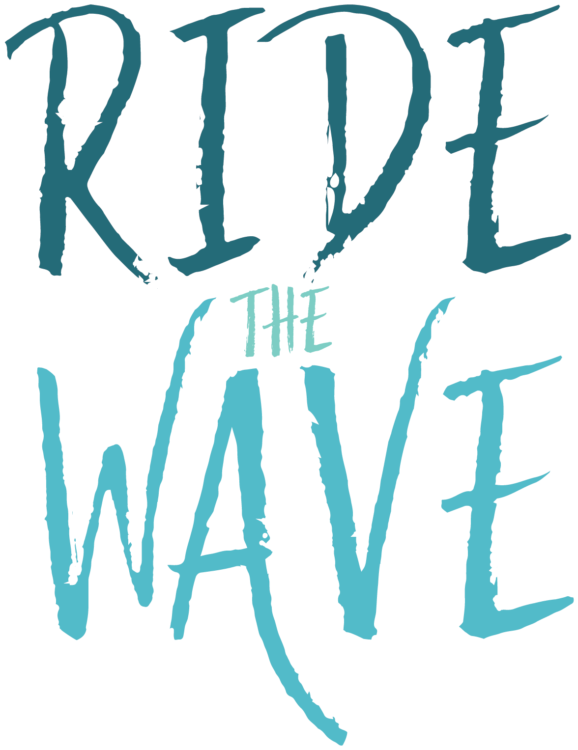
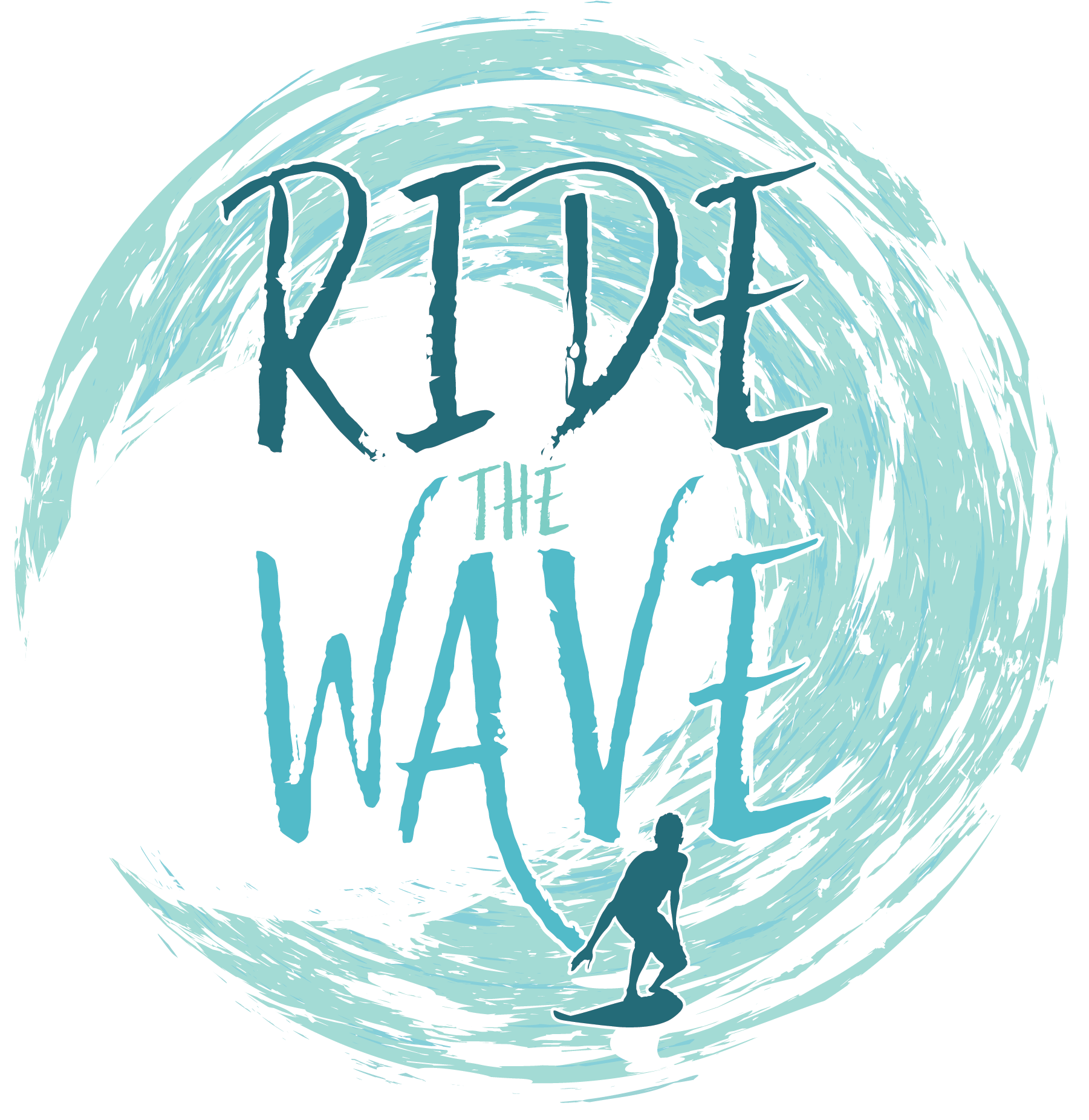
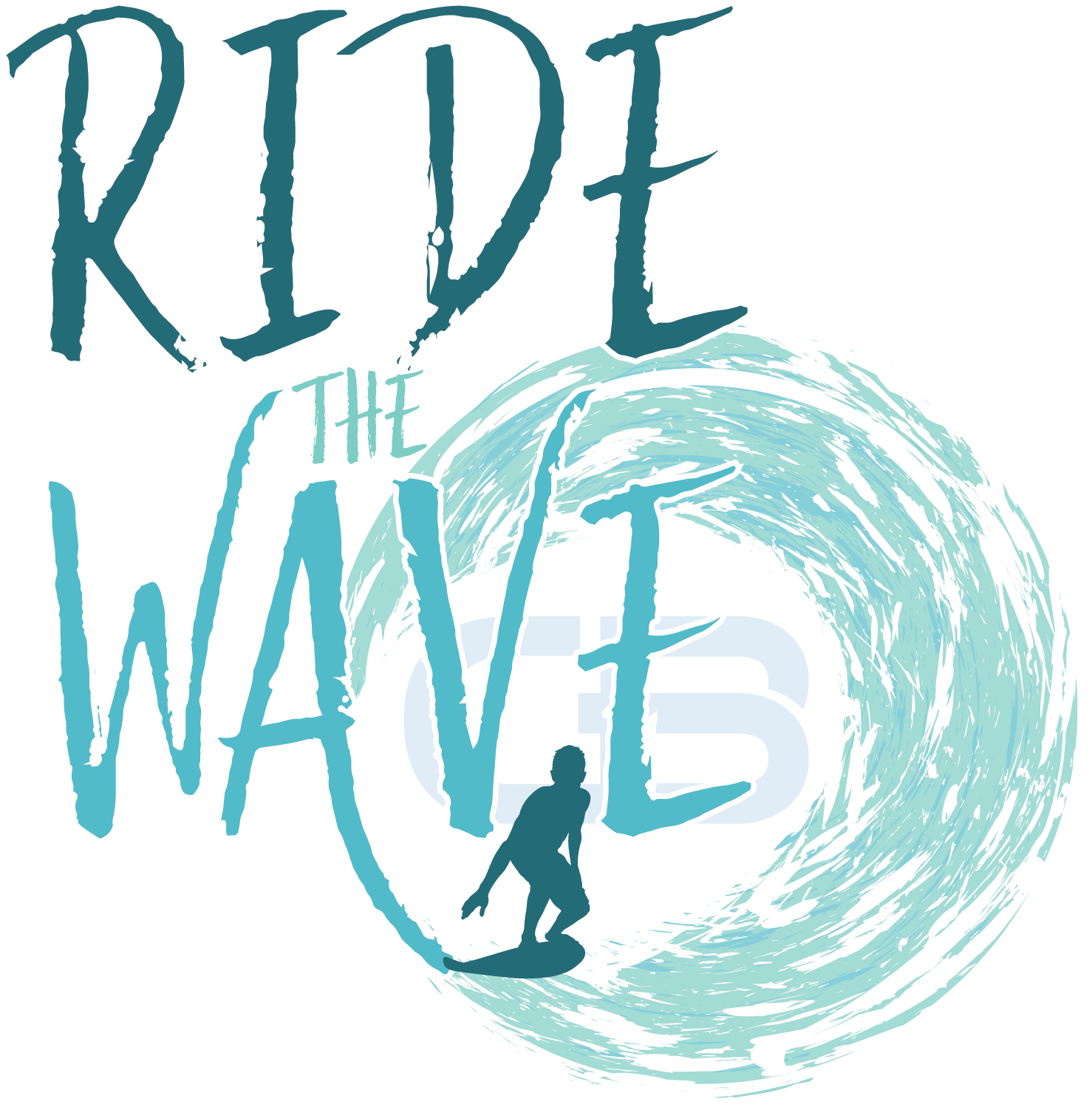
Concepts: In the early stages of exploration for the Ride the Wave graphic, I experimented with many different typographic and visual depictions. This included a surfer inside the barrel of a wave, the hang–ten symbol, overlapped surfboards, and more. My process involved solidifying the hierarchy and typographic treatment of the wordmark first. Then I explored pairings with graphical elements and the wordmark to find the best fit.